Optimising check-in Flow for passengers
AirAsia
Research and Wireframe • 2022

Background
AirAsia is a Malaysian multinational low-cost airline headquartered near Kuala Lumpur, Malaysia. AirAsia operates scheduled domestic and international flights to more than 165 destinations spanning 25 countries.
They were in the midst of creating a super app, that not only serves their budget flights but has other features for Malaysians. However, they were facing issues with their check-in flow. Many passengers would not use their app to check-in. How can we make the check-in experience as contactless as possible?
Timeline
4 Weeks
Role –
With a team of 4 UX designers, I was responsible for:
-
UX Research
-
User Interview conduction
-
Wireframes
-
Prototype
Project Objectives:

-
Make check-in experience as contactless as possible.
This means reducing the interactions at the airport counters and check-in kiosks. -
Ensure all the guests have access to their own boarding passes so they don't have to reprint them at the airport
-
Declutter e-Boarding Pass. The design is a bit cluttered. Guests have given feedback that it's not easy to scan for information.
Problem statement:
How might we reduce the frustration and pain-points of the mobile check-in process so that more customers will complete their check-in?
Discover
We made Assumptions
Based off the key business challenges that Airasia provided us with, we first made a list of assumptions that we had to validate with our user research.
Complexity & Effort
Customers find mobile check in complex and troublesome; having to fill up the particulars on their own.
Flexibility & Choice
Customers want to be able to make changes to their booking easily during check-in and they believe mobile check-in removes that option.
Assurance
Customers feel more assured and comfortable checking in physically with counter staff during check in.
Accessibility & Reliability
Customers feel that a physical pass is within easy reach and not susceptible to potential technological failures i.e. wifi connectivity, scanning kiosks, phone battery.
Research Objective
1
Understand Customer’s needs, motivations and challenges with mobile check-in flow
2
Identitfy Actions taken by customers in current check-in process and what they expect
3
Evaluate Customers’ reasons for choosing to complete check-in at airport counter instead of on mobile
Discover

Desk Research Findings:
We went to research if our hypothesis was true by looking through reviews, articles, comments and journal articles. We then gathered our findings.

Journal article 1:
Flight ticket booking app on mobile devices: Examining the determinants of individual intention to use
Malaysia, 2017, Sample size of 300
Journal article 2:
Airport passengers' adoption behaviour towards self-check-in Kiosk Services: the roles of perceived ease of use, perceived usefulness and need for human interaction
Malaysia, 2019, Sample size of 402
We went to research if our hypothesis was true by looking through reviews, articles, comments and journal articles. We then gathered our findings.
We conducted an independent walkthrough of the current flow to test usability and interface issues:
Heuristic Evaluation
).png)
Competitor Analysis

We wanted to focus on 3 aspects in our Analysis:
✅ How is their process of check-in is like?
✅ How are relevant information presented?
✅ What do users think about their app?


User Survey
We conducted a user survey with sample size 42 to explore the attitudes, behaviours and usability:

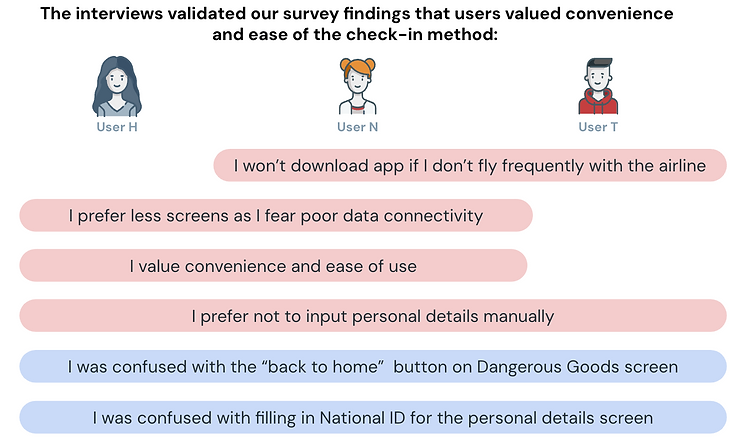
User Interview


User Persona


Interactive Prototype
We came up with a solution and wireframe, which we derived from our research and findings.
%20(1)_gif.gif)
A closer look at the prototype


System Usability Scale
We also conducted direct/ observable usability testing with two groups of 5 users and compared the system usability scale scores for the current and new prototypes:
Before
Current Prototype:
68.5 pts
Avg. Score by 5 users


After
84.5 pts
New Prototype:
Avg. Score by 5 users


-
SUS 10 statements were ask
-
✅ Average score: 84.5
-
👍 Users found the flow of the new prototype more at ease for them.
While the final output wasn't 'groundbreaking', it gave us another perspective of
potentially solving the issue using simpler approaches
— Chris Ng, Air Asia
Thinking through what I could have done better:
-
Lack of research conducted in flight mobile app usage. Most research is on app transactions and bookings.
-
Lack of budget for conducting User interviews, hence we coudln't get many participants. We managed to get people around us to participate instead.
-
No connection between the persona and the final prototype. Lacked User journey.
-
Prototype had too many pop ups.


