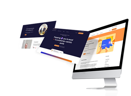
Increasing customer Confidence and sales
Digtial Product Owner/ Wireframe • 2023

Background
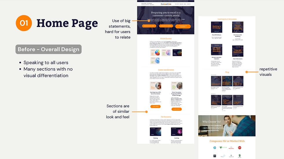
Curiouscore is a startup Tech educational institution that focuses on mid-career transitioners and upskillers. However, the company was facing issues with their current website. Besides having an outdated look and feel, the website wasn't generating many qualified leads. The navigation was also problematic, and the presentation of course information was unclear, which could have contributed to the generation of unqualified leads.
Timeline
8 Months
Role –
With a team of 5 UX designers, I was responsible for:
-
I was the Product owner, I managed the whole team and developers to make sure it met my stakeholder's expectation and timeline
-
Wireframing, research
Objective:
-
Increase qualified leads, focusing on users that "Download Brochure " for UX Career Accelerator Programme
-
Organise the Navigation to make it clearer, especially on the difference in products, B2C and B2B.

Problem statement:
How might we increase mid-career switchers' confidence in CuriousCore, so that they would be interested to find out more about the UXCA?
Research Objective
1
Understand the goals and needs of mid-career transitioners and upskillers in (i) career transitioning/upskilling and
(ii) visiting CuriousCore’s site
2
Understand how users currently achieve their goals and the pain points they face.
3
Understand how users perceive the current CuriousCore site with respect to their goals.
Diving into desk research
58% of workers are willing to take a pay cut in order to completely change industries.
-
No. 1 reason: unhappy in their previous job sector
-
Tied for 2nd place: higher pay and greater flexibility
Average person who switches career is 39 years old
-
May be in a more secure financial situation than younger workers - less risk, more flexibility to make a major switch.
Average worker takes 11 months to consider a career change before making the move
-
Most consideration given to what they’d need to succeed in a new sector.
Just over one-third report enrolling in specific educational or training programs in
order to make the transition.
-
Suggests workers prefer to move to an industry where they can transfer
their existing skills.
Discover
Competitive Analysis
Since the market is saturated with UX training providers from bootcamps, online educational platforms, to traditional educational institutions - we wanted to study what the competition did well and where we could improve.

Design Pattern


Key Recommendations
-
Competitions' copy focuses on the user - use of "you" and "your" consistently across their websites.
-
The navigation menu could be organized into more useful and descriptive categories.
-
Information could be better presented in a sharp and concise manner with clear illustrations/diagrams.
Key Opportunity
-
Across the competition there seems to be an overall lack of a personalised touch - a gap that CuriousCore could better address.
User Interview/ Usability Testing

Using affinity mapping, we extracted key themes from the responses.

Key Usability Issues
-
"Information overload"
- Many sections, long paragraphs and bullet points.
- Made users feel as though there's a lot to read and yet no clear focus. -
Unclear presentation of information
- Information presented repeatedly, but differently - which makes it hard to understand.
- Information is not intuitively organised, users cannot find what they need. -
Annoying visual elements, such as:
- Pop-up screen to schedule a call
- Overly magnified text and images and other formatting issues
Design Mandate
#1
Visibility of system status
Amp up the human touch, so that users feel that CuriousCore cares and that they will be well supported and guided in their career transition.
Wireframing
Creating
Prototype
Intensifying Human Touch

Increasing Credibility

Improving Clarity


Before and After


Above the Fold


Navigation Bar


Navigation Bar

Future-proof organisation of CuriousCore's offerings
-
Organising courses by topic
-
Organising resources and events by format
-
In the future, an "All" page with sort and filter functions
-
Reduce clutter and enhance effectiveness
-
Reduce no. of tabs and length of lists
-
Short, consistent naming
-
Made navigation bar sticky

A closer look at the prototype
-
None out of the 6 users raised issues with the content/information.
-
None out of the 6 users encountered difficulty in locating information
-
5 out of the 6 users noticed the "Download brochure" CTA and would willingly click on it.
Thinking through what I could have done better:
-
We could have made proper check out flow to see how it could have worked with the new site. However that was later iterated and down towards the end of the project.
-
The personas created were not as detailed or as useful as we thought it could have been. Hence we removed it along the way.
%20(1500%20%C3%97%201080%20px)_gif.gif)
