Overview
About the project
CuriousCore is a tech education startup focused on mid-career transitioners and upskillers. The existing website felt outdated, course information was hard to compare, and navigation created confusion — resulting in low-quality leads.
As Product Designer and Product Owner, I led the end-to-end redesign of the website experience to drive higher-quality leads and build user confidence in the brand.
Challenge
Objective & Problem Statement
Objective
Drive higher-quality leads for the UX Career Accelerator by improving content structure, CTA visibility, and clear separation between B2C and B2B offerings.
Problem Statement
How might we help mid-career switchers feel confident in CuriousCore's value so they take the next step in their decision journey?
Research
Understanding the landscape
Research Objectives
-
01
Understand the goals and motivations of mid-career switchers and upskillers.
-
02
Identify how they currently navigate their decision journey and where friction occurs.
-
03
Evaluate how well the current CuriousCore website supports their needs and builds confidence.
Desk Research Insights
of workers are willing to take a pay cut to change industries, with job dissatisfaction as the primary driver.
is the average age of a career switcher — often more financially stable and willing to invest in long-term change.
on average spent evaluating a career transition, focusing heavily on what they need to succeed before committing.
enrol in structured education or training, indicating a strong preference for pathways that build on transferable skills.
Implication: Mid-career switchers are deliberate, risk-aware decision makers who need clear outcomes, credibility, and a structured learning path before taking action.
Competitive Analysis
With a saturated market of UX training providers — from bootcamps to online platforms and traditional institutions — we analysed how competitors positioned their offerings, communicated value, and structured their conversion journeys to identify opportunities for differentiation.


-
Competitors' copy focuses on the user — consistent use of "you" and "your" across their websites builds a personal connection.
-
Navigation menus could be organised into more useful and descriptive categories to reduce confusion.
-
Information presented in a sharp, concise manner with clear illustrations performs better across comparable sites.
-
Across competition, there is an overall lack of personalised touch — a gap CuriousCore could strategically address.
User Interviews / Usability Testing


Using affinity mapping, we extracted key themes from user responses to identify core pain points on the existing site.
Key Usability Issues
Content Overload
Users felt overwhelmed by the volume and density of content, which slowed decision-making.
Inconsistent Structure
Inconsistent structure made it difficult to compare information and locate key details.
Broken Flow
Premature and visually dominant elements interrupted the browsing flow and reduced confidence in the experience.
Low Confidence
Users left the site without a clear sense of whether CuriousCore could actually support their transition goals.
Design Mandate
How we do it
Improve Clarity
Visibility of system status — ensure users always know where they are, what's available, and what to do next throughout the browsing experience.
Amp Up the Human Touch
Make users feel that CuriousCore cares and that they will be well supported and guided in their career transition journey.
Wireframes
From insights to structured solutions
The wireframes were developed from our research findings, turning insights into structured, solution-driven design decisions. Each layout was tested and iterated based on usability feedback before moving into high-fidelity design.

Mid-fidelity wireframes — translating research into structure
Final Prototype
The redesigned experience
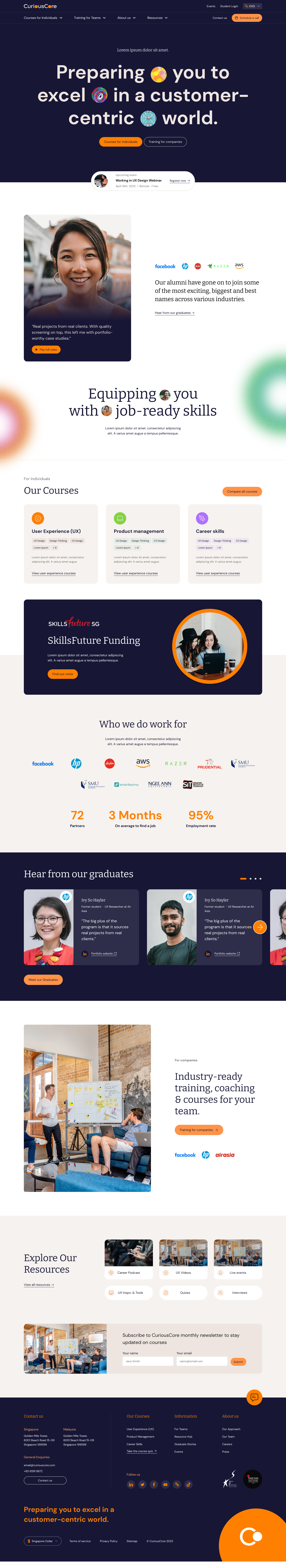
The final prototype brought together improved information hierarchy, clearer CTAs, and a warmer brand voice — guiding users through their decision journey and building confidence at every step.

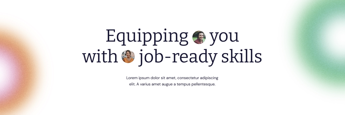
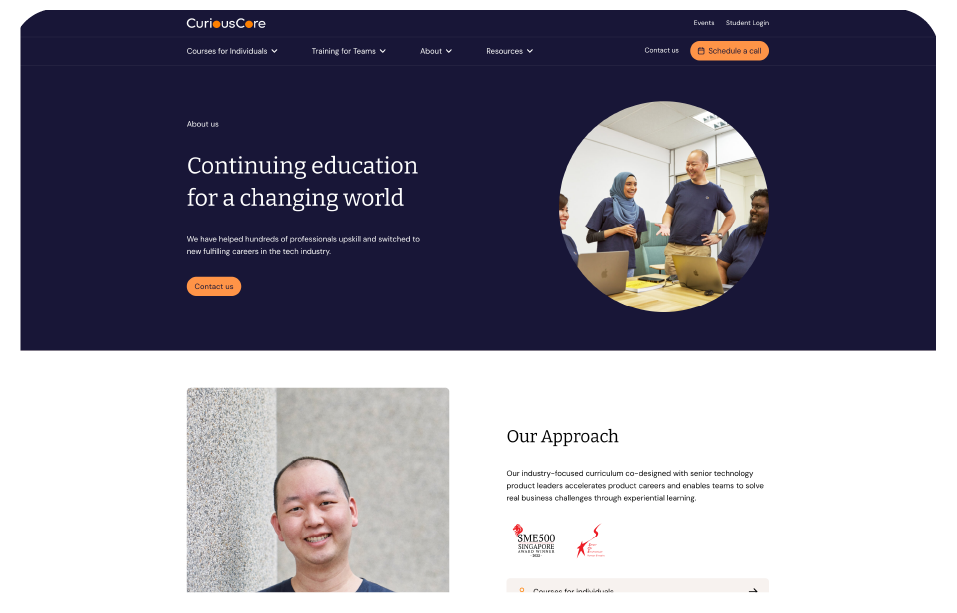
Hero and navigation — clearer structure and welcoming tone


Key screens — improved content structure and CTA visibility

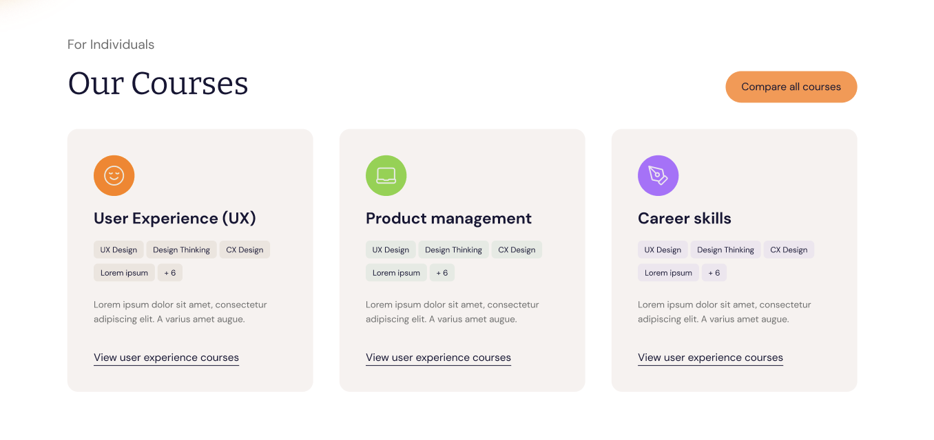
Course comparison flow — simplified and scannable

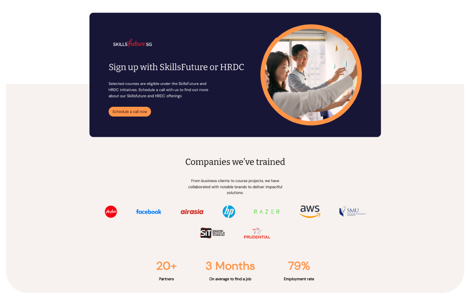
B2B section — clear separation from B2C offering


Results
Validated outcomes from usability testing
Usability testing with 6 users showed a clear improvement in how users navigated and understood the site. These results validated that the revised information hierarchy and navigation reduced friction, increased user confidence, and strengthened conversion intent.
Users found clarity in content and structure
Users found the primary CTA with positive intent to engage
Users found success in locating relevant information
What I'd Improve
A natural next step would be to test the full conversion flow — evaluating how the new structure performs beyond the discovery phase and into completed enrolments.
While personas were developed during early stages, they did not evolve alongside our research findings and had limited impact on design direction. We shifted toward behaviour-based insights for faster, more informed decisions. In future iterations, co-creating data-driven personas with the team would strengthen alignment and long-term product thinking.