From browse to buy — fixing the checkout experience
A UX research and wireframing project focused on diagnosing cart abandonment for a Singapore-based women's fashion e-commerce brand.
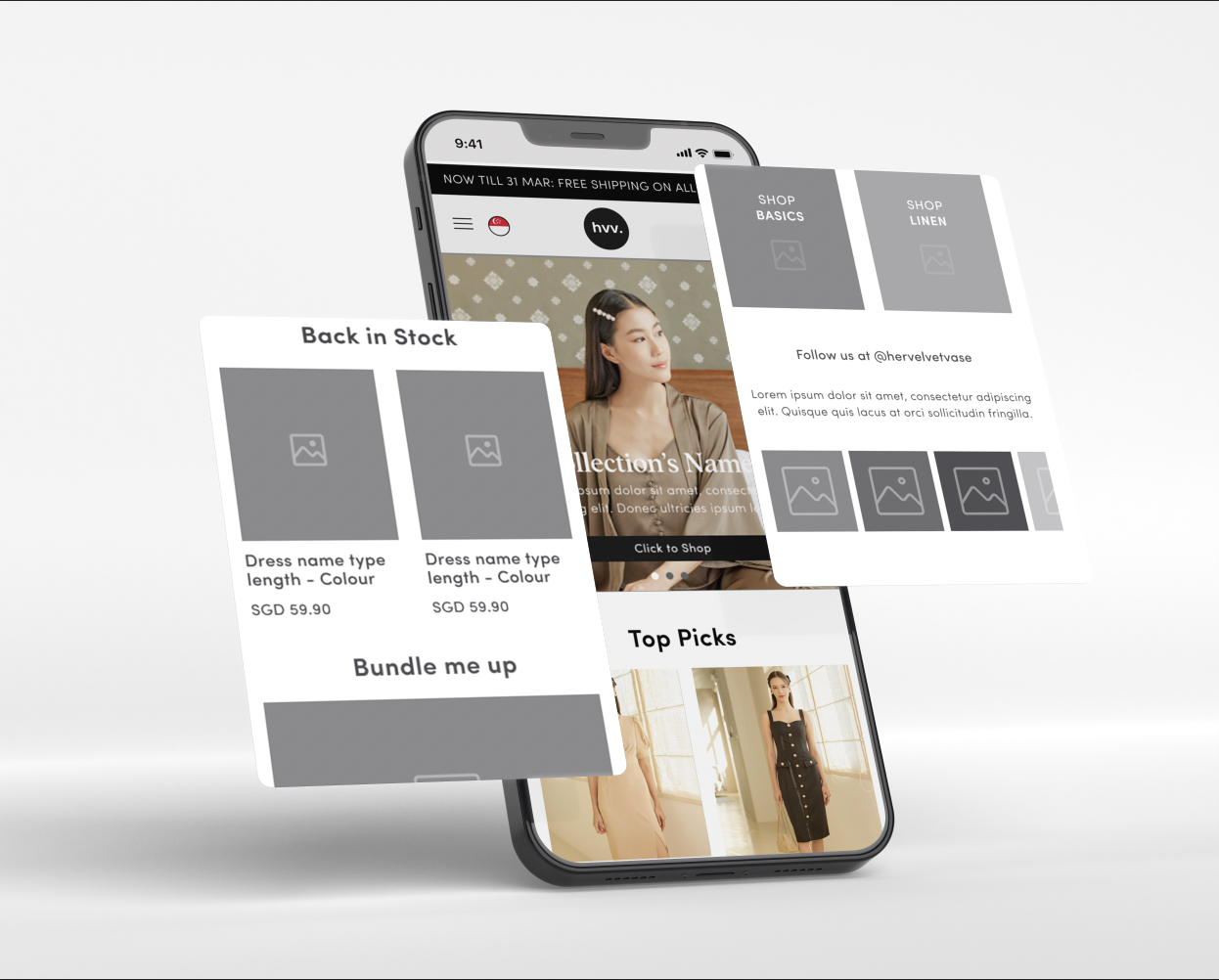
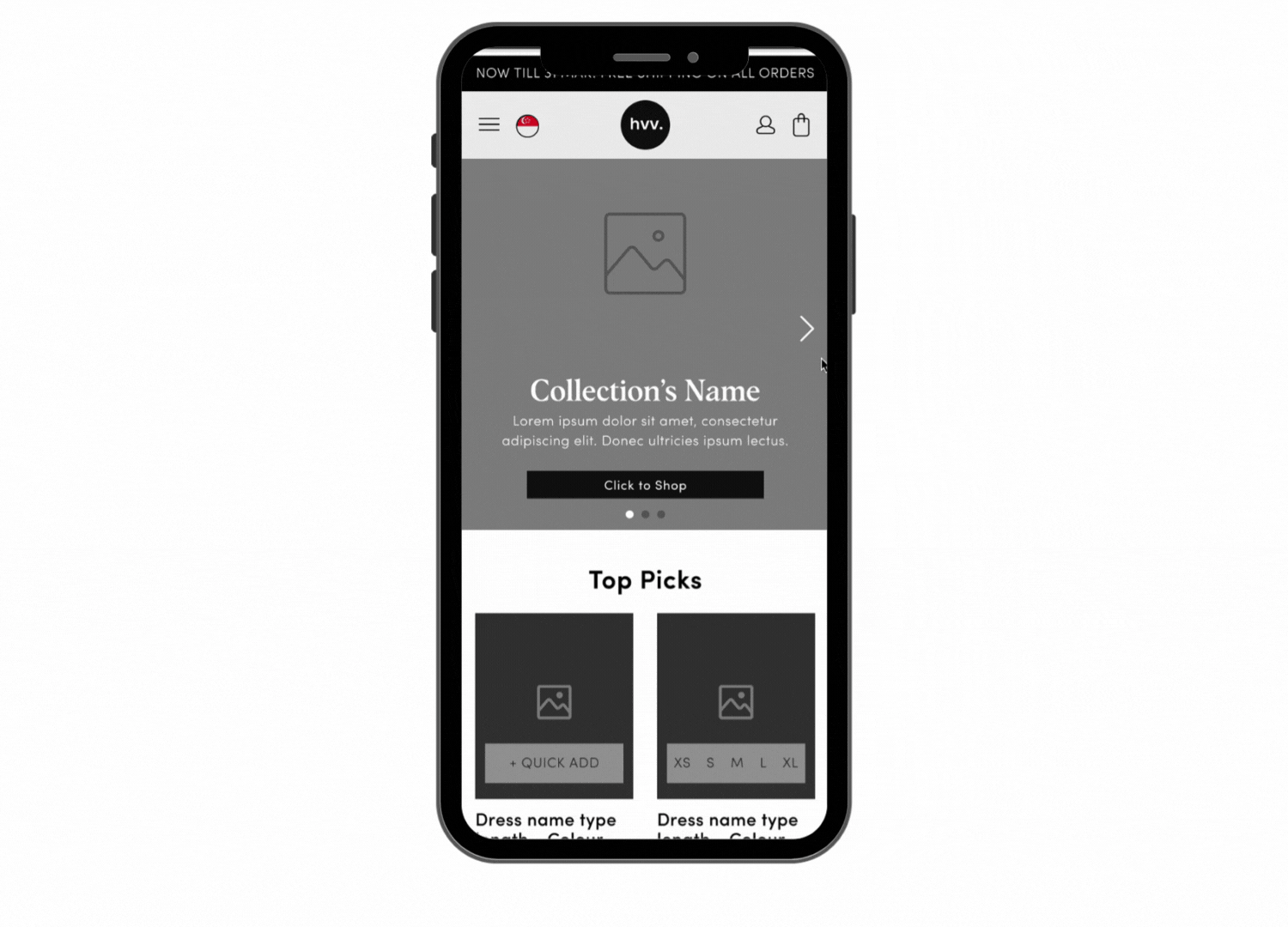
Her Velvet Vase — final wireframe screens
Background
About the project
Her Velvet Vase is a Singapore-based e-commerce fashion brand focused on basic women's clothing. They approached us with a pressing challenge — a significant number of customers were abandoning their carts, resulting in a high bounce rate and unfinished transactions.
Their target audience comprises local and Asian females aged 20 to 45. Our task was to understand why this was happening and redesign key touchpoints to reduce abandonment and improve the overall purchasing experience.
Project Flow
Step 01
The Challenge
Problem Statement
How might we reduce cart abandonment on Her Velvet Vase and improve the end-to-end purchasing experience for local and international customers?
- 01 Lack of structured feedback from existing and new customers on the purchasing experience on HVV
- 02 Lack of understanding of what international customers were experiencing when navigating the platform
- 03 Identifying friction points in the checkout flow that led to high cart abandonment rates
Step 02
Heuristic Evaluation
We evaluated the existing Her Velvet Vase website against Nielsen's 10 usability heuristics to identify fundamental UX issues before conducting user research.
Heuristic compliance score across 8 evaluated principles
Visibility of system status — biggest area of concern
Heuristics evaluated across the full shopping flow
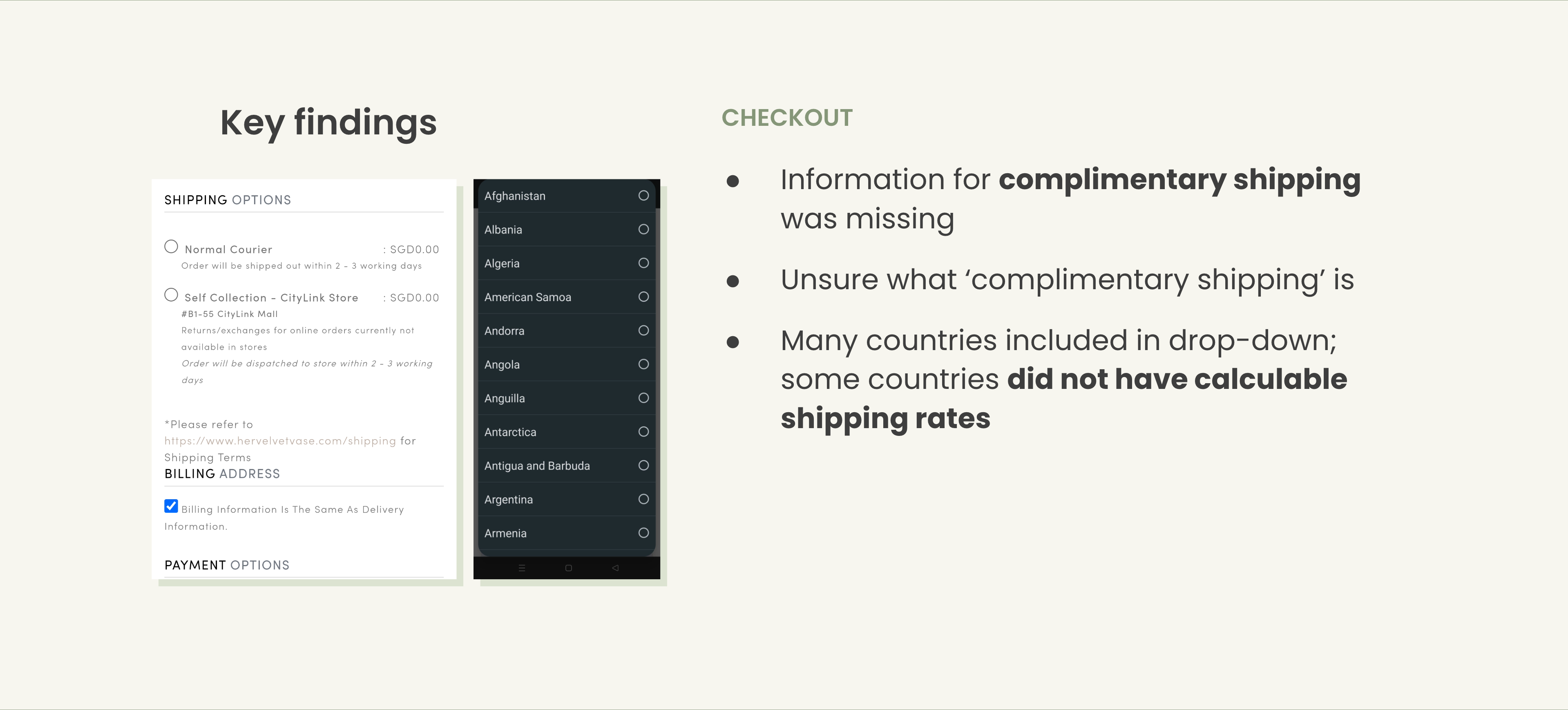
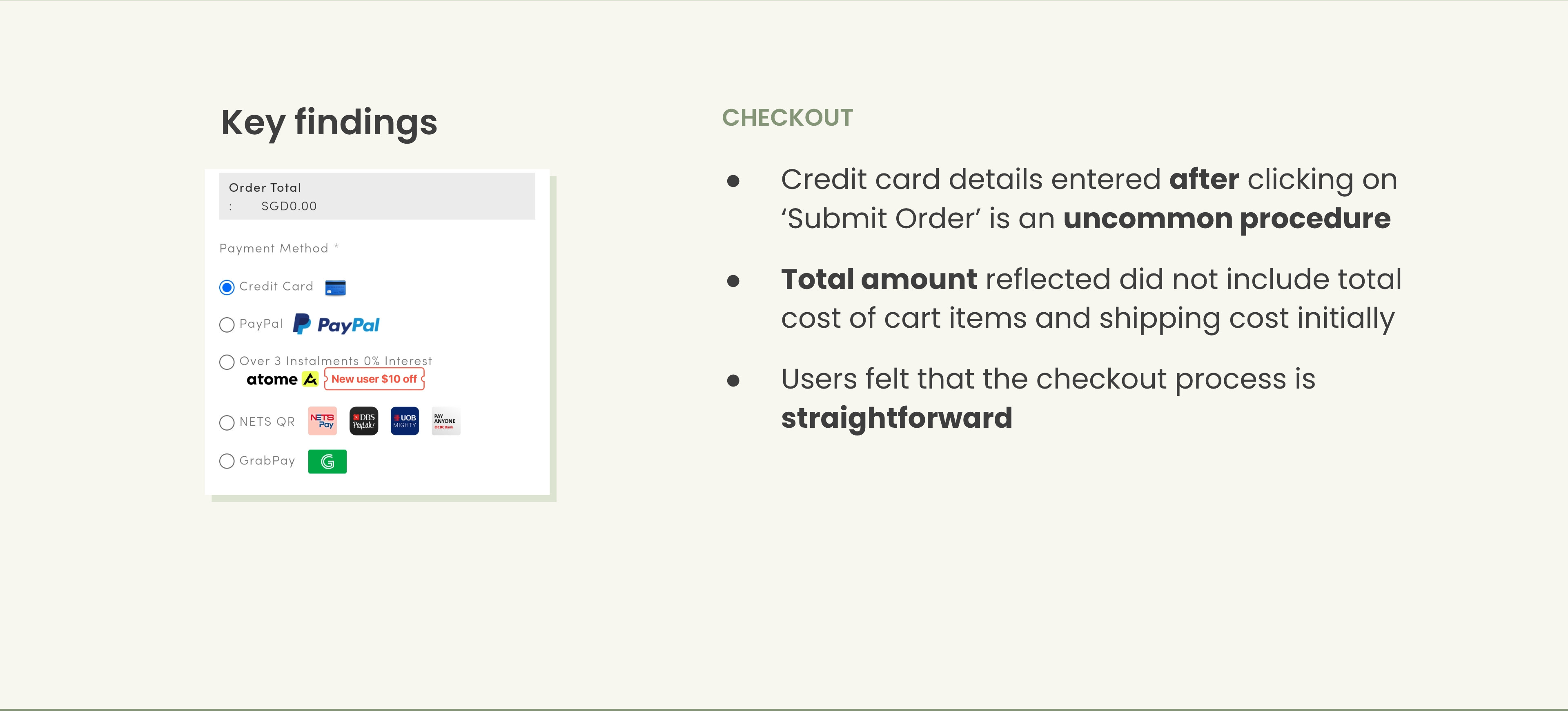
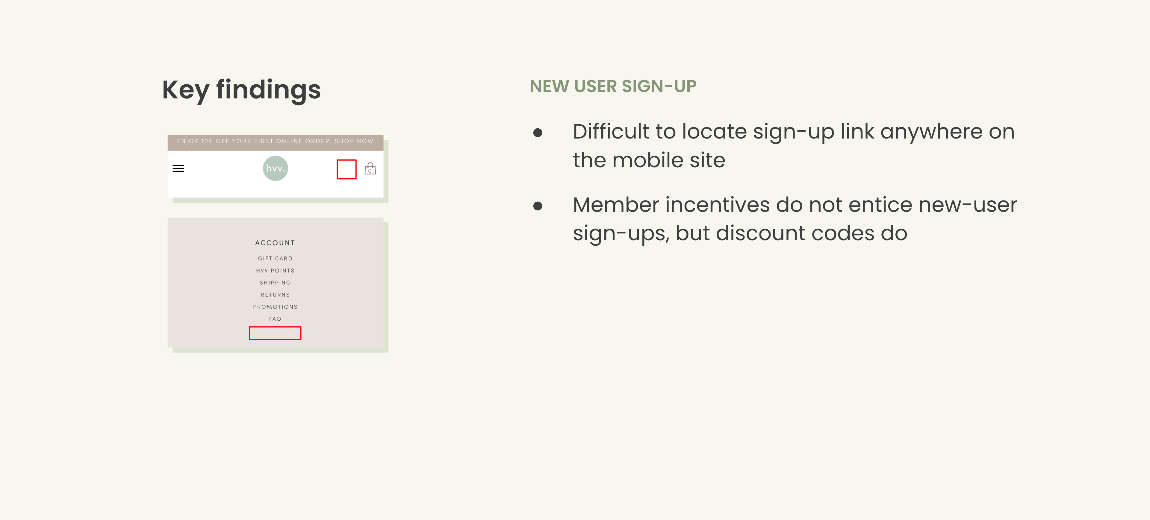
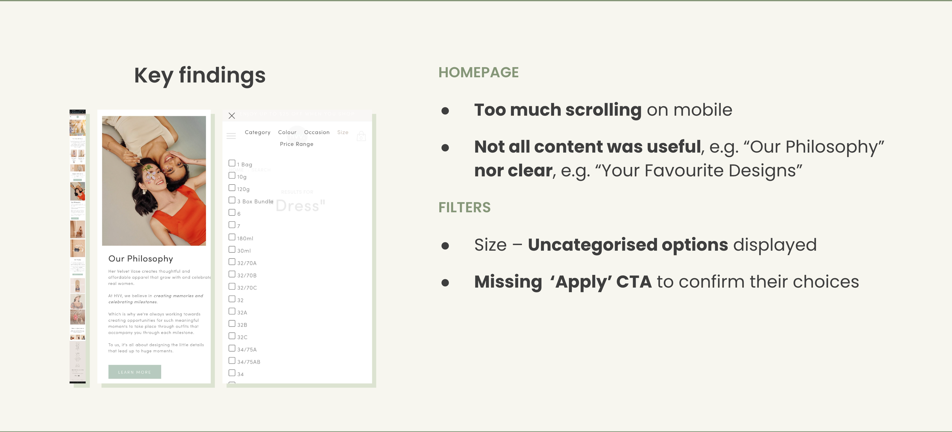
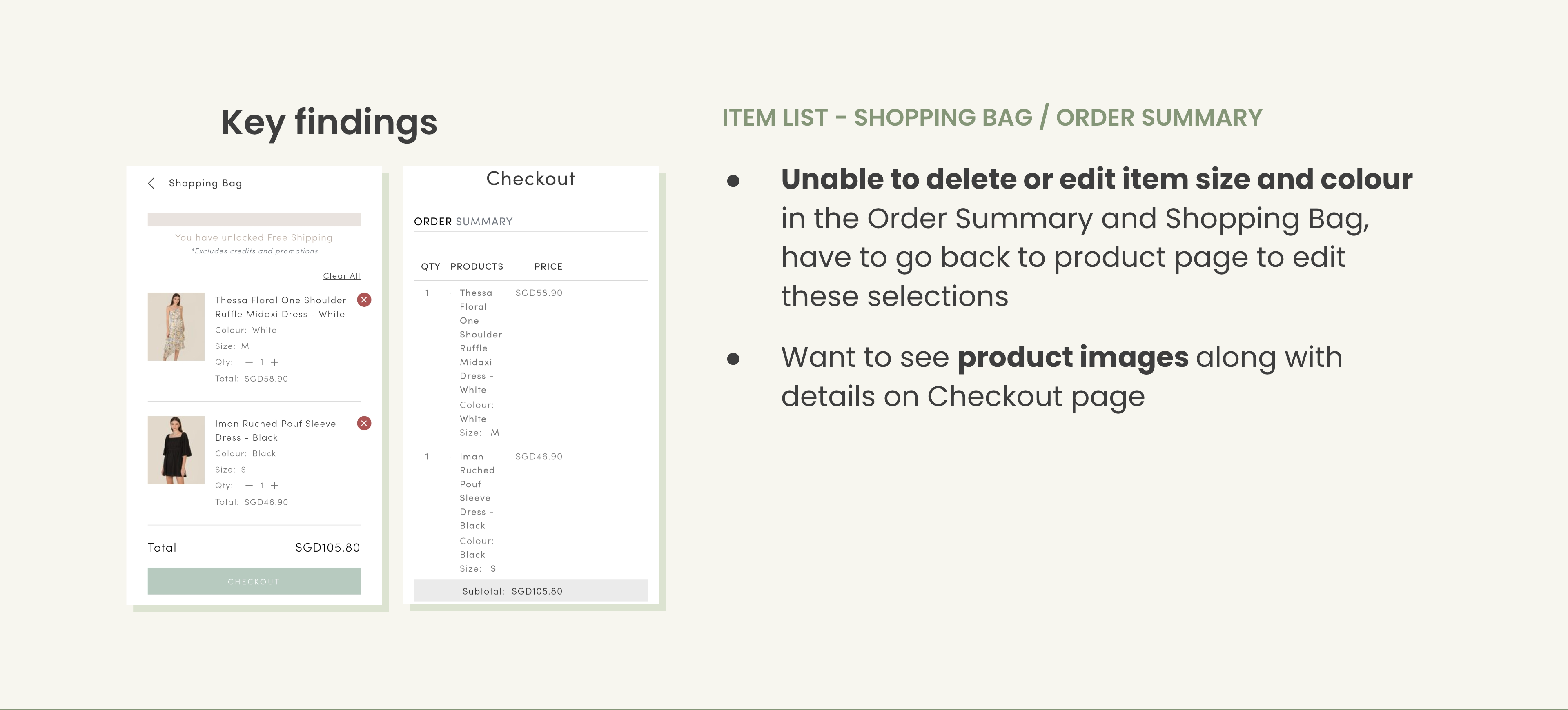
Key Findings
- Low colour contrast — poor visibility of copy and CTAs throughout the site
- Lacks visible differentiation between clickable, disabled states, and required fields in forms
- No "No results found" message when no relevant products appear based on applied filters
- System status feedback missing during loading and checkout transitions
Step 03
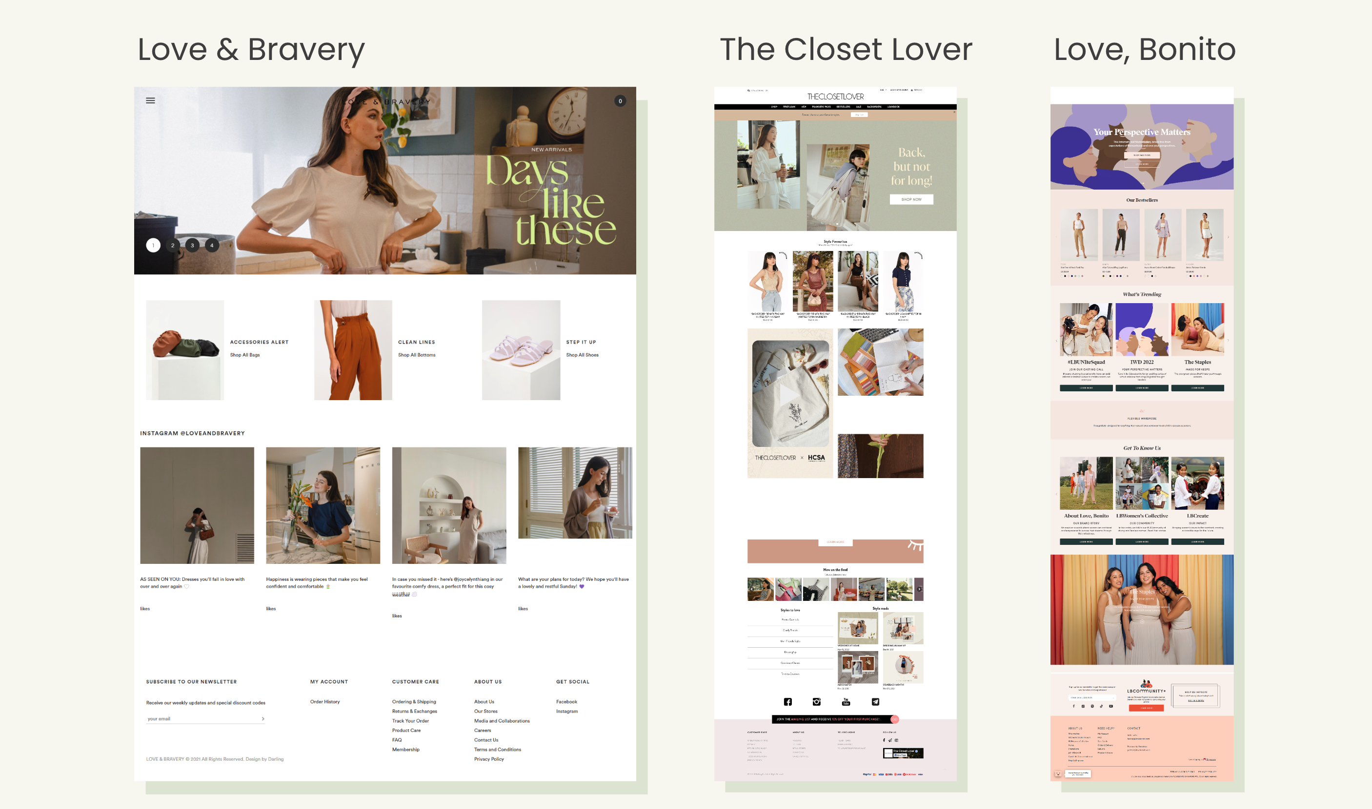
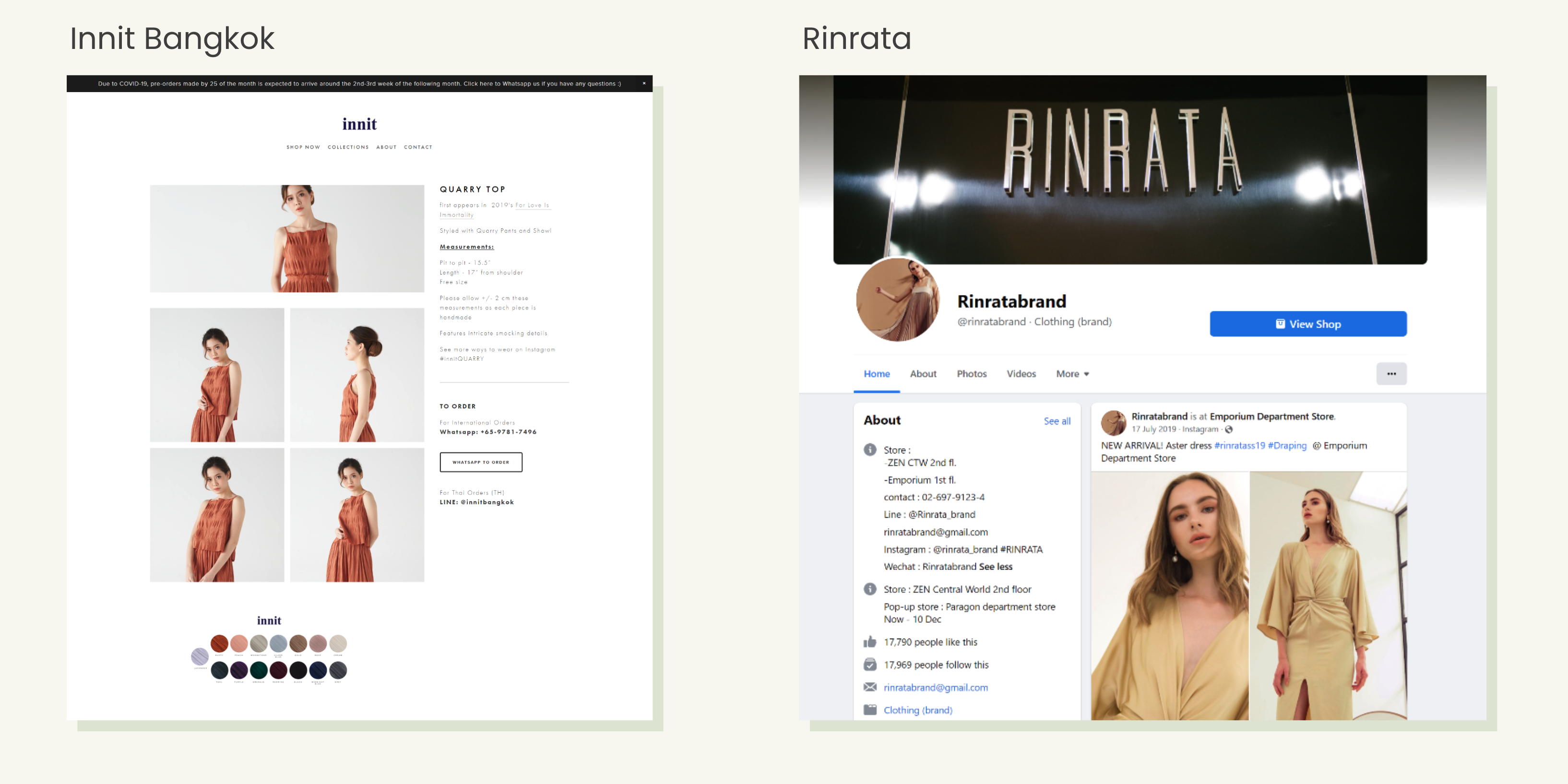
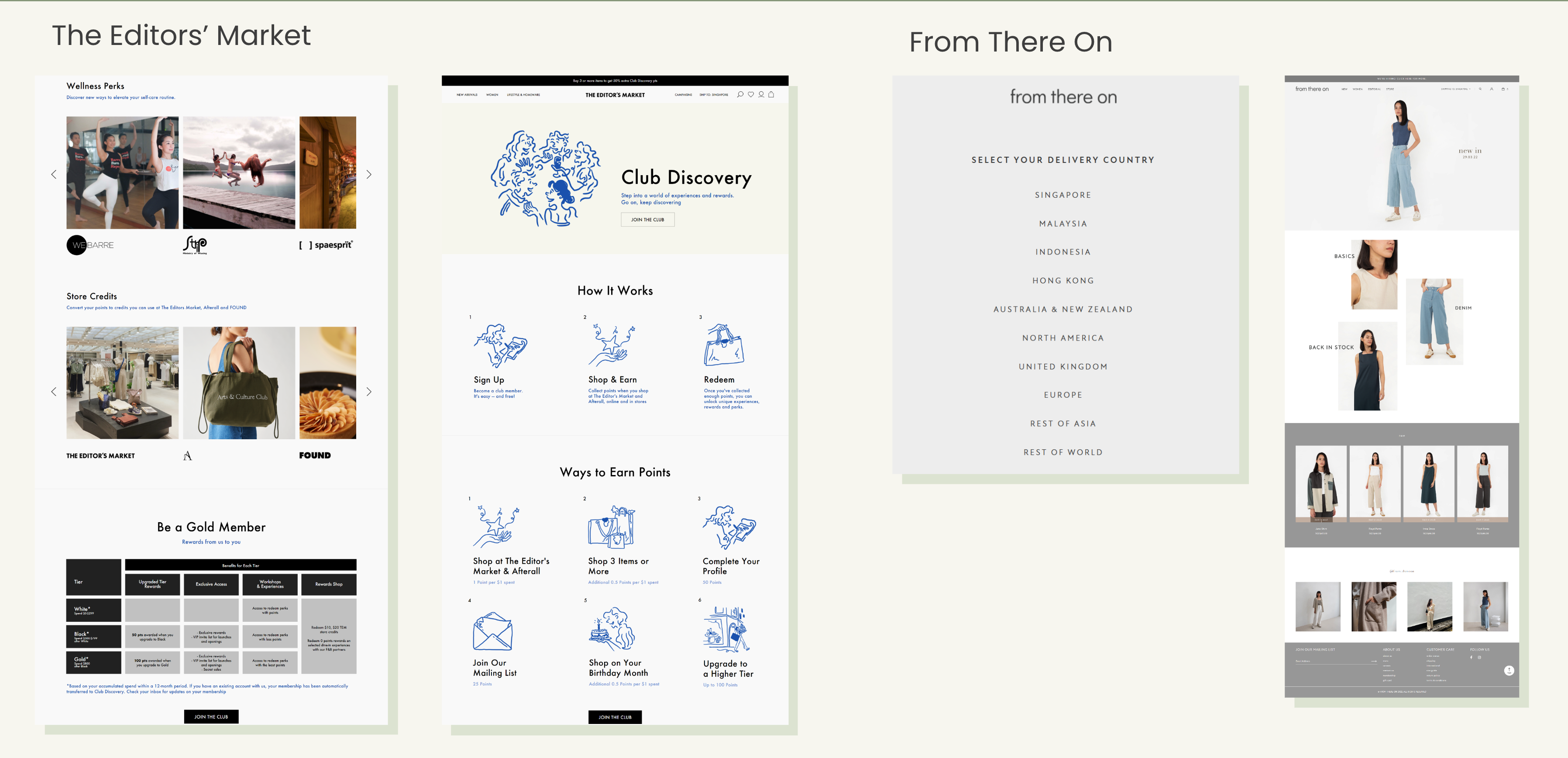
Competitive Analysis
We benchmarked Her Velvet Vase against local brands, overseas markets, and international players to identify gaps and uncover opportunities for differentiation.
Commonalities
Same visual language across brands with similar products and target audiences — minimalist aesthetic, neutral colours, restocks and backorder features.
Opportunities
Social commerce on LINE and WeChat to reach new audiences. Moodboxes, exclusive prints, and brand loyalty programmes as key differentiators. Highlight international shipping options prominently.
Step 04
User Research
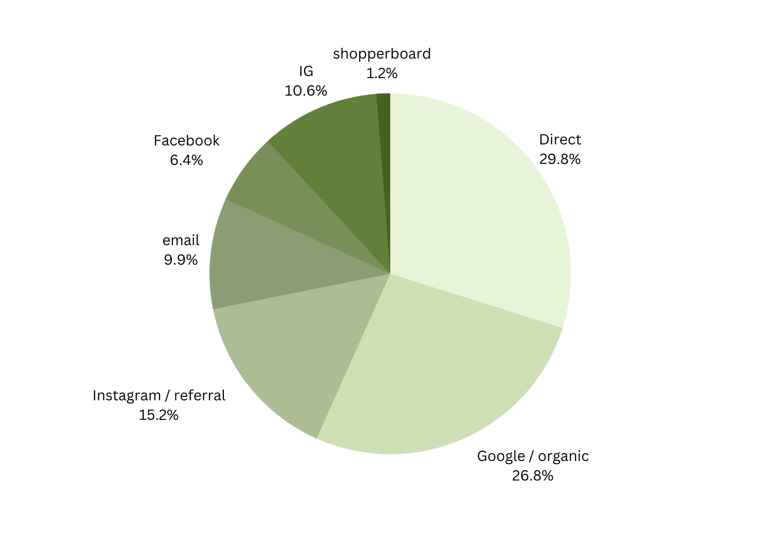
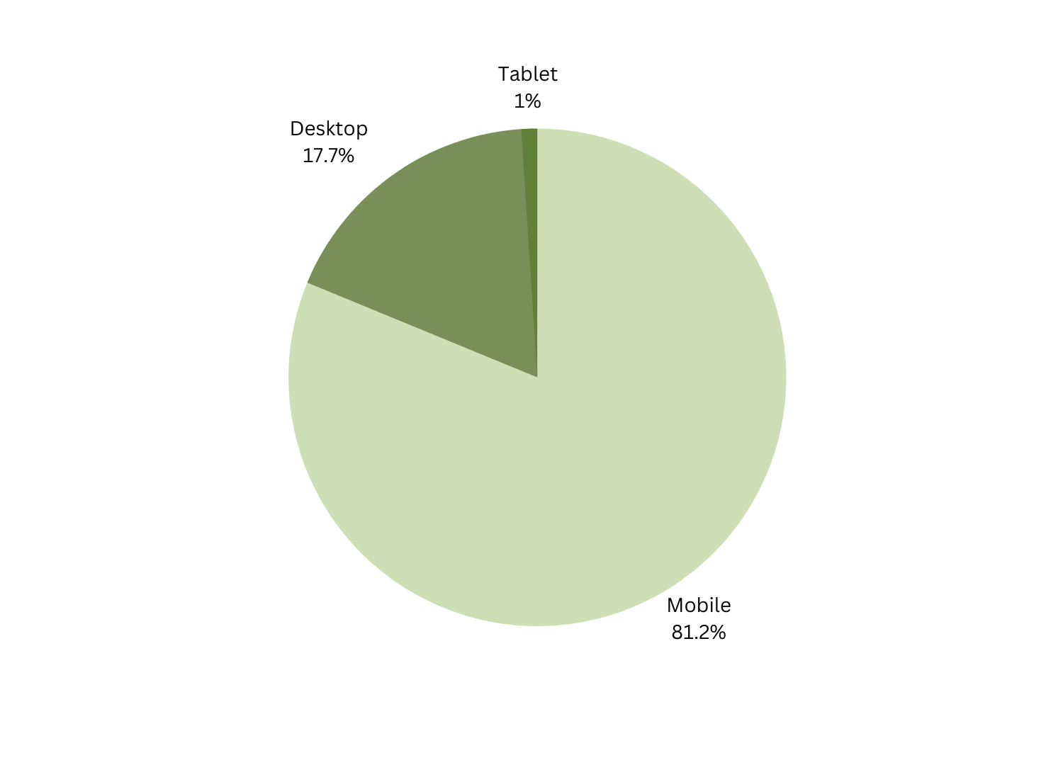
We conducted interviews with 9 users — 5 existing HVV customers and 4 new users — aged 20–30, Singaporean, and experienced online shoppers.
Total users interviewed
Existing HVV customers
New users unfamiliar with HVV
What motivated their purchases
- Cheaper prices during promotions and flash sales
- Love for the designs, quality, and unique floral prints
- Posting on Instagram to earn HVV loyalty points and rewards
- Influenced by friends, social media, and influencer recommendations
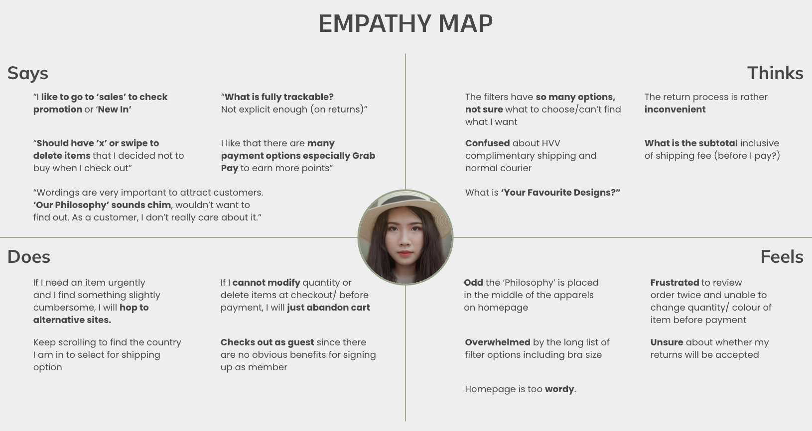
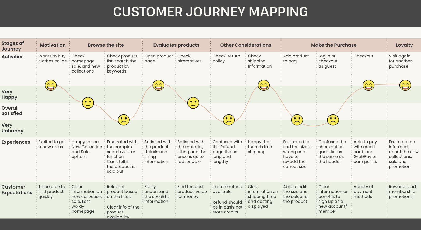
Users valued the brand's aesthetic and community, but friction in the checkout flow — especially unclear form states and missing feedback — interrupted what should have been a motivated purchase journey.
Step 05
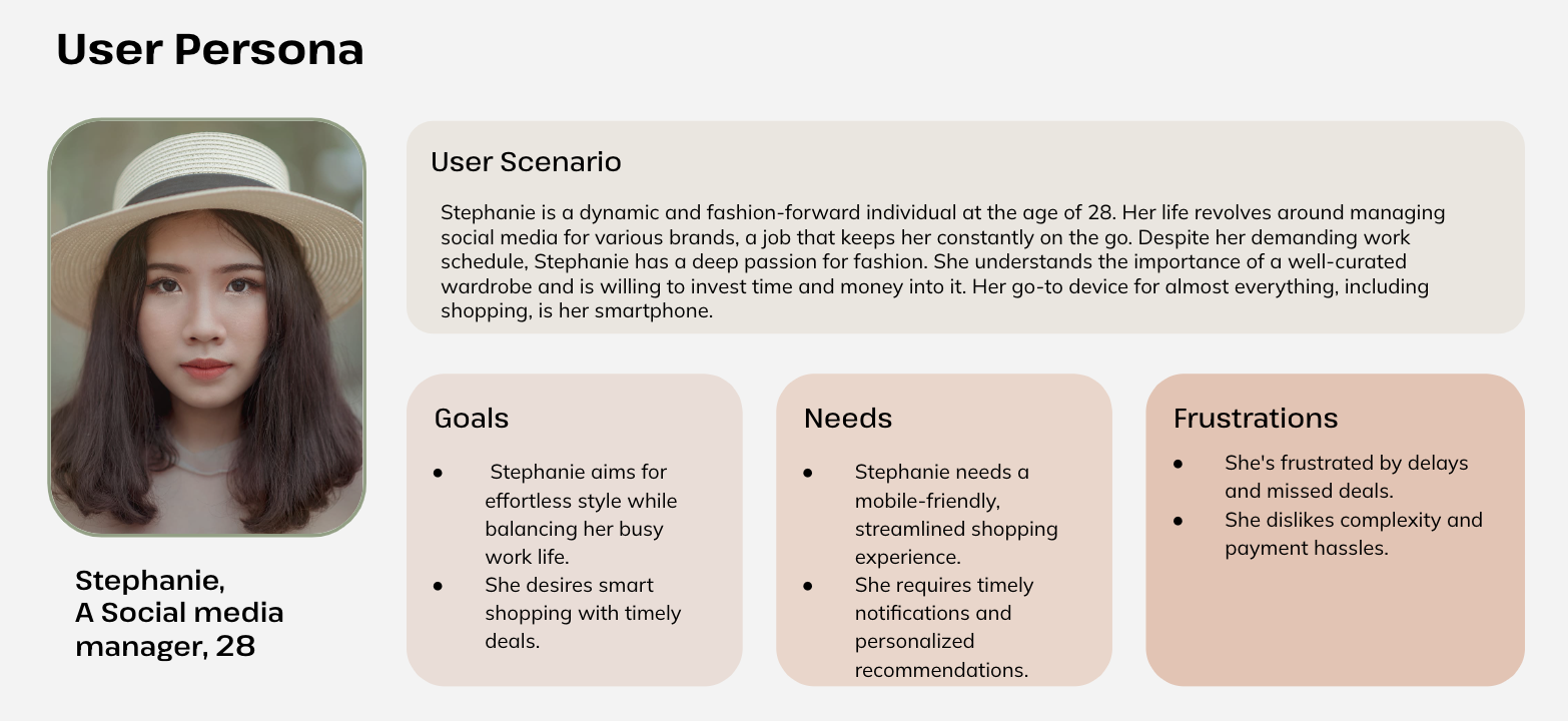
Personas
We developed personas after our research to ground design decisions in real user motivations and frustrations. Initially we skipped this step in favour of empathy maps — but quickly realised the brand needed defined personas to guide prioritisation.
Step 06
Usability Testing
We validated our wireframes using Maze, running a moderated remote usability test with real users. Participants were asked 10 SUS (System Usability Scale) statements and completed key tasks through the prototype.
Average SUS score — Excellent
Average time spent on the homepage
Users completed the task at the Checkout page
 1 / 5
1 / 5
Step 07
Wireframes & Prototype
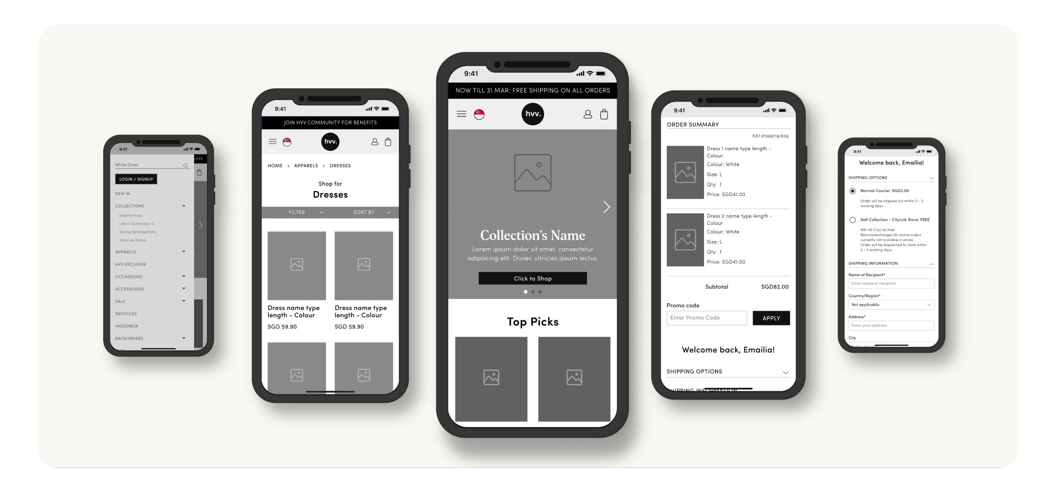
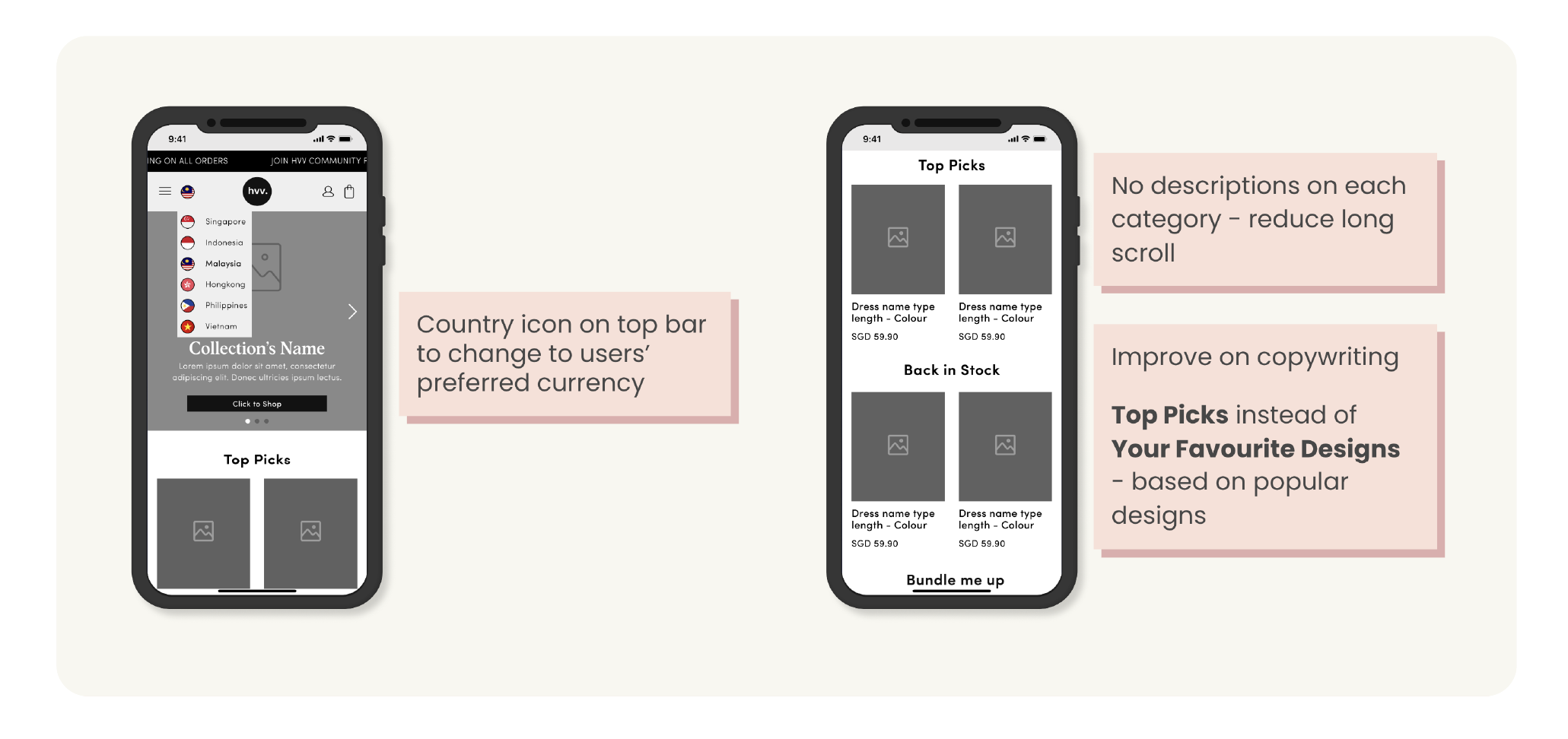
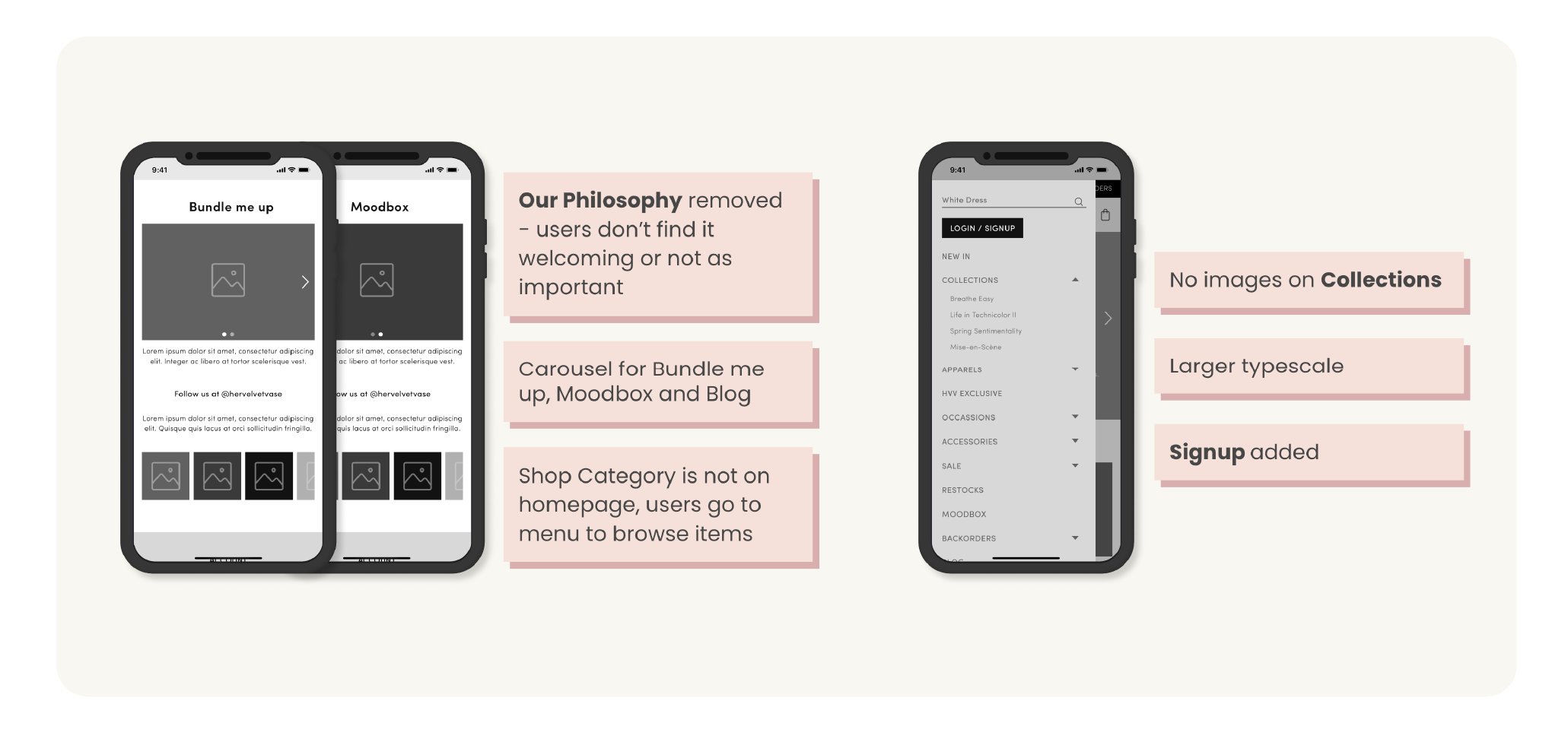
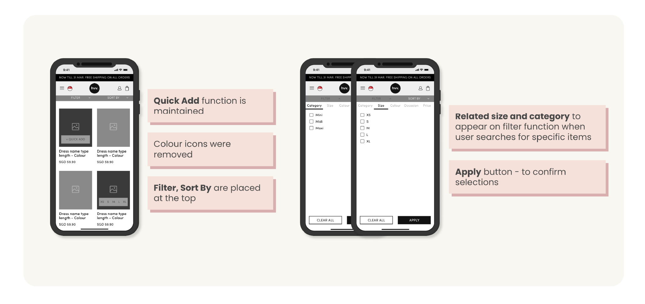
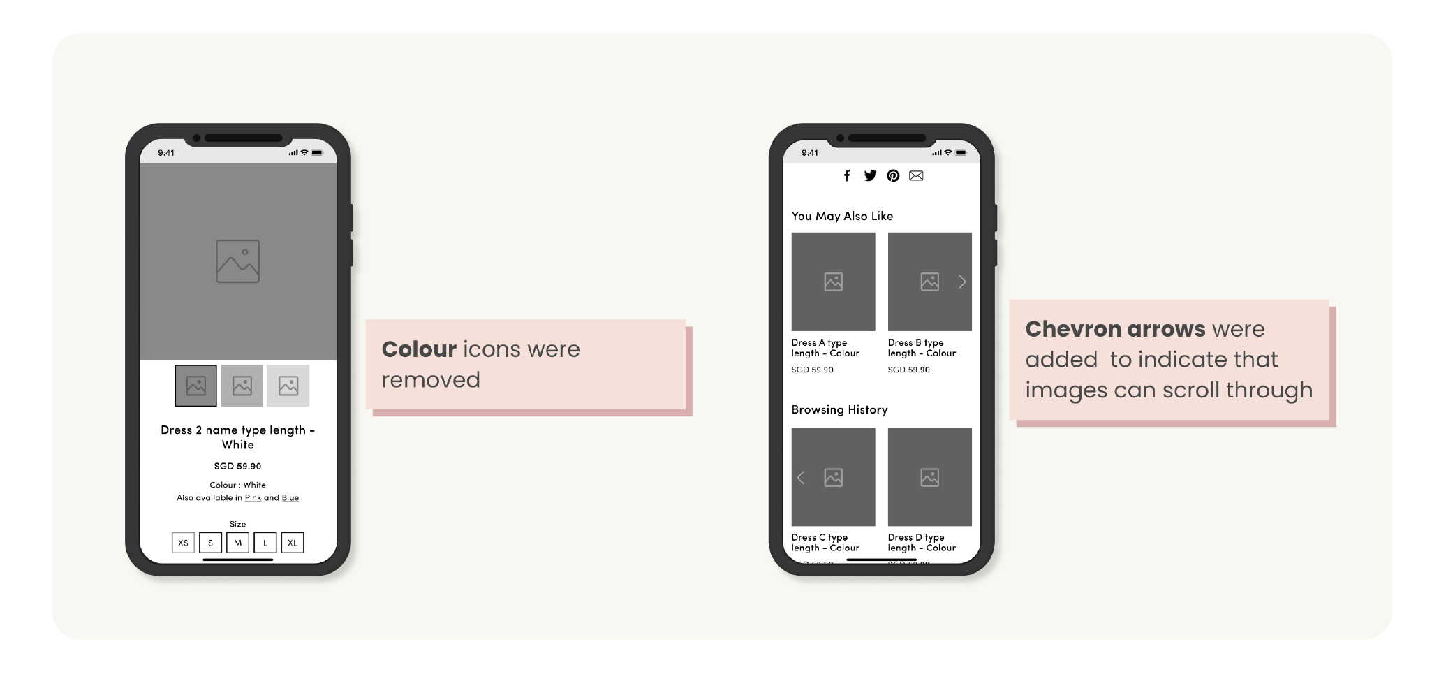
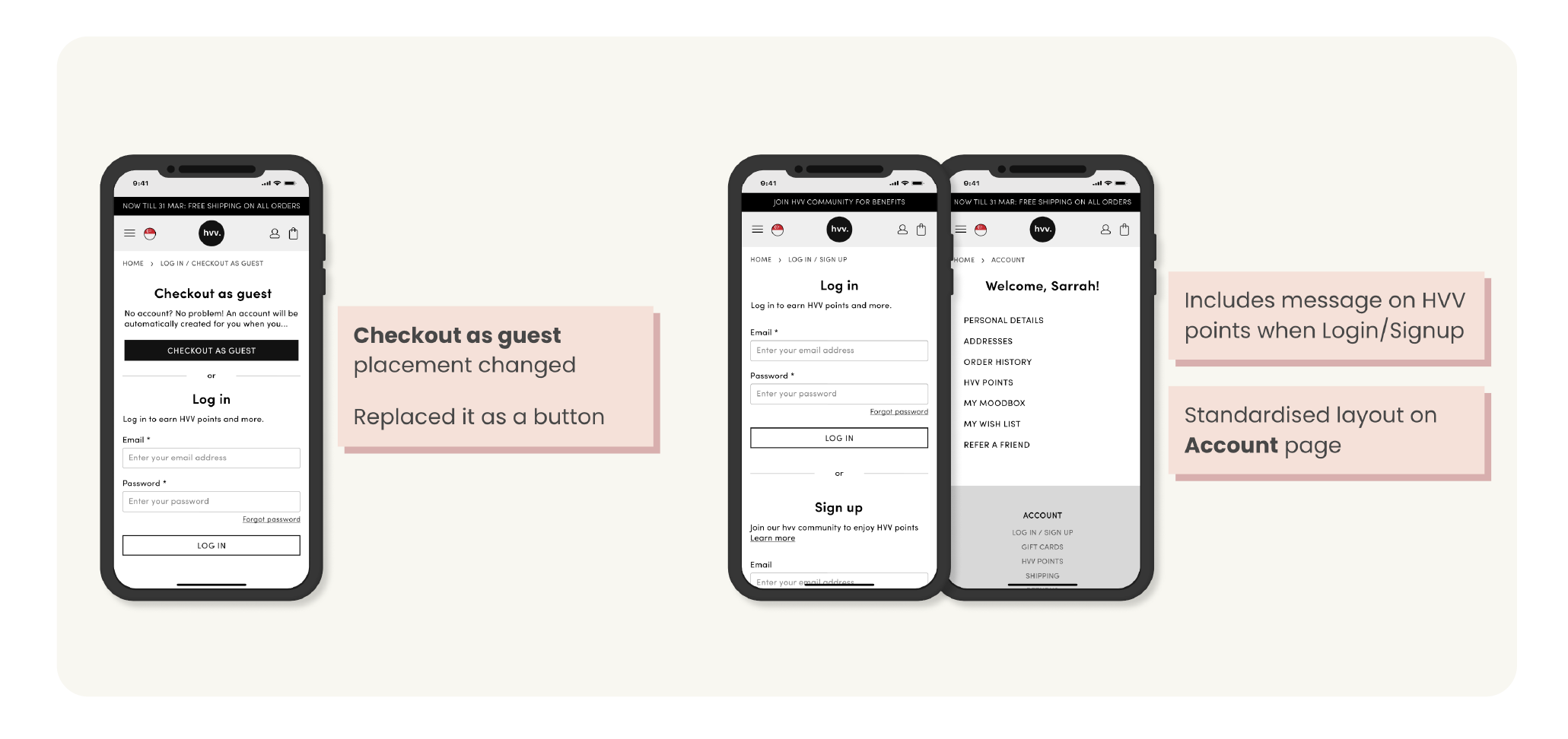
We redesigned key screens across the browsing, product, and checkout flows — addressing the friction points surfaced in our research. The wireframes focused on clearer states, better feedback loops, and a more intuitive path to purchase.
 1 / 6
1 / 6
Interactive prototype walkthrough
Looking Back
Reflection
We initially skipped creating personas and jumped straight into empathy mapping and a customer journey — which left some decisions without a clear user anchor. We course-corrected by implementing personas once we realised how much they helped the brand prioritise features and trade-offs.
If time had permitted, we would have loved to run usability testing with real users on the final prototype to validate our wireframes and make further iterations. The Maze testing gave us strong confidence, but first-hand observation would have added another layer of insight.
Overall, this project reinforced how impactful a structured research process is — even within a short 4-week sprint — and how quickly small friction points compound into cart abandonment at scale.
Results
Client Feedback
We were particularly satisfied with the way the information and suggestions were presented to us. It was well thought out, structured, helpful and actionable. The team also kept in mind the limitations we shared and were able to simplify their suggestions to us which made it easy for us to understand and discuss with our programmers.
— Clara, Product & Brand Owner, Her Velvet Vase