
.png)
Challenge
The landscape
Corporate banking UX is complex not just because of the interfaces, but because of everything connected to them.
Every workflow sits between business priorities, operational processes, technical limitations, security requirements, and user behaviour. The challenge was finding the balance between usability, scalability, speed, and accuracy while designing within real-world systems.
My Process
A thinking partner
How a problem becomes a screen
Reframe the Brief
Business request ≠ design problem. I spend real time here before opening Figma.
Map the Constraints
Compliance, tech limits, existing patterns. Know the walls before you draw.
Sketch the Logic
Flows and decisions first. Whiteboards and rough sketches before any UI.
Design Within It
Make it feel simple despite everything underneath. This is the real craft.
Stay Through Delivery
Dev review, QA, user testing, iteration. What ships matters more than what's in Figma.
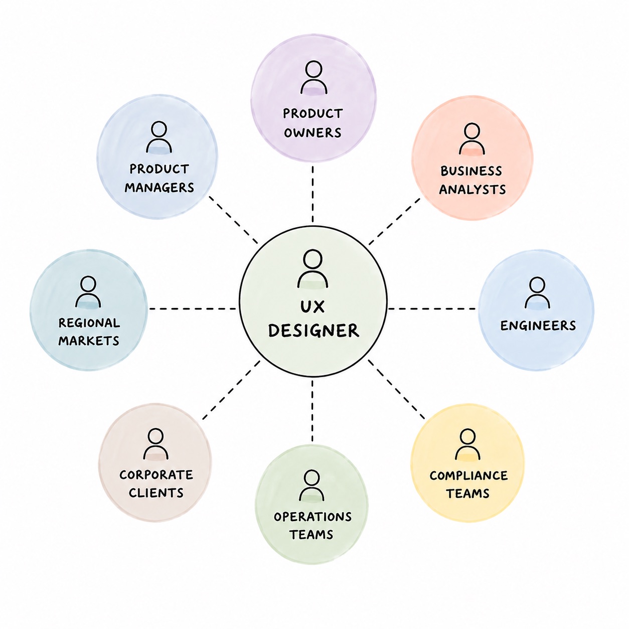
Working within an agile product team, I contributed across initiatives spanning payments, operational tooling, account management, and workflow improvements.
My role covered the end-to-end design process — from research and ideation to collaboration, delivery support, testing, and iterative improvements. Beyond execution, I worked as a thinking partner alongside Product Owners, Business Analysts, engineers, System Analysts, and stakeholders to align user needs, business goals, and technical constraints.
Research
Understanding before designing
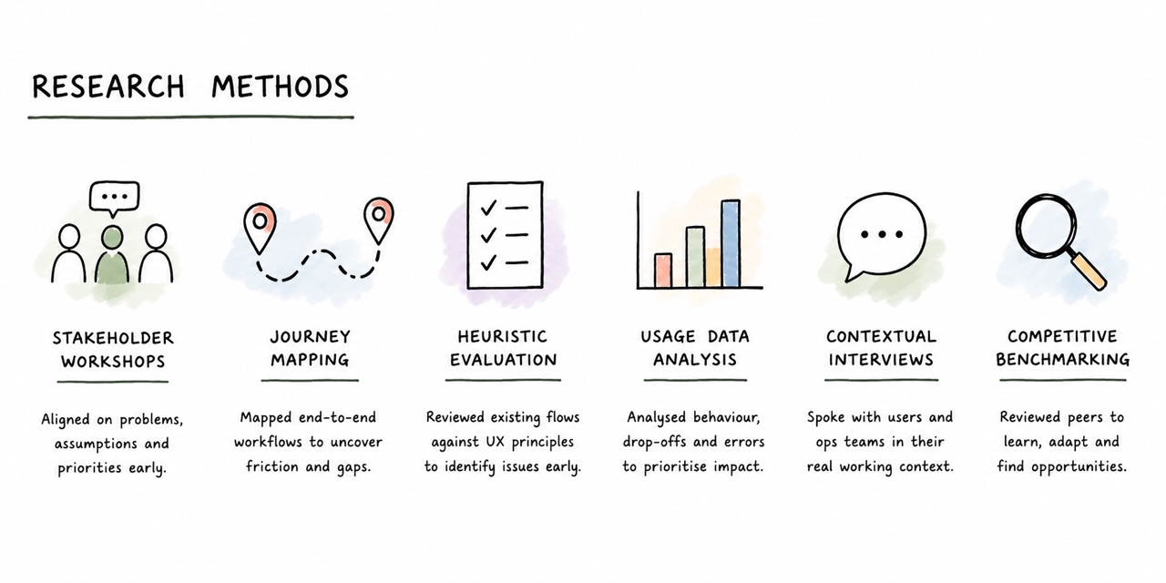
Research in enterprise banking is rarely straightforward. Access is limited, workflows are complex, and operational context matters as much as direct user feedback.
To validate decisions early, I combined stakeholder input, workflow analysis, usability reviews, and behavioural insights throughout the design process.
Research artefacts across the project — structured thinking and documentation that aligned teams and informed every design decision.
Collaborated with
How I Work
How I show up, every project.
01 / Agile Delivery
Move fast. Stay intentional.
Working in agile environments meant balancing speed, quality, and delivery realities. The challenge was knowing what needed refinement immediately, what could iterate later, and communicating those decisions clearly across teams.
02 / Product Thinking
Design for confidence, not decoration.
Corporate banking users come to complete transactions quickly and accurately. Money naturally creates anxiety, so the goal was never to create flashy experiences, but clear, trustworthy, and low-friction ones.
I approached every workflow by asking what users needed to feel confident enough to move forward — whether through clearer hierarchy, simpler flows, better guidance, or reducing unnecessary cognitive load.
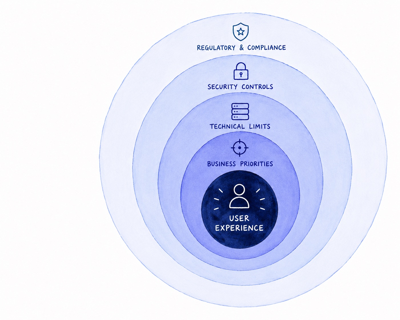
03 / Systems & Security
Constraints are the brief.
Every design decision lives inside these layers. The UX work isn't just about making things usable, it's making them usable within all of this.
Regulatory & Compliance
Multi-market banking rules, audit trails
Security Controls
Authentication, fraud prevention, access
Technical Limits
Legacy systems, engineering feasibility
Business Priorities
Sprint timelines, stakeholder needs
User Experience
Where the real craft lives
04 / Cross-Functional
Better ideas come from shared thinking.
The work was highly collaborative, involving regular discussions with Product Owners, Business Analysts, engineers, and stakeholders across different markets and operational teams.
A large part of the role was aligning perspectives, challenging assumptions, and shaping solutions together early before moving into delivery. Often, quick conversations, whiteboarding sessions, and collaborative ideation helped uncover better product decisions than working in isolation.
05 / Validation
Design doesn't end at handoff.
In a platform where errors have real financial consequences, validation wasn't a phase at the end — it ran alongside design from the moment a flow took shape.
Moderated Usability Testing
Task-based sessions with corporate users and proxies. If a user hesitated, that was a signal.
A/B Testing
Tested layout and flow variants to validate design decisions with real usage data before full rollout.
User Acceptance Testing
Validated designs with stakeholders and compliance teams. UAT was an alignment checkpoint, not just sign-off.
Design QA
Reviewed built screens against Figma specs during sprint demos. Flagged deviations before they reached production.
Key Initiatives
Four problems. Four ways of thinking through them.
01 / 04
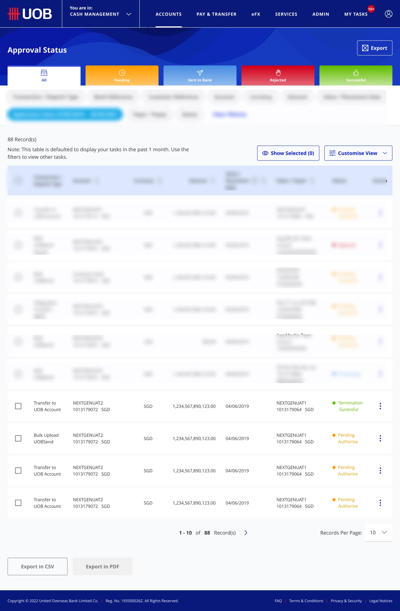
Making high-stakes payments feel less frightening
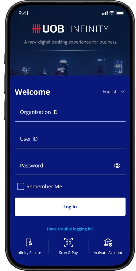
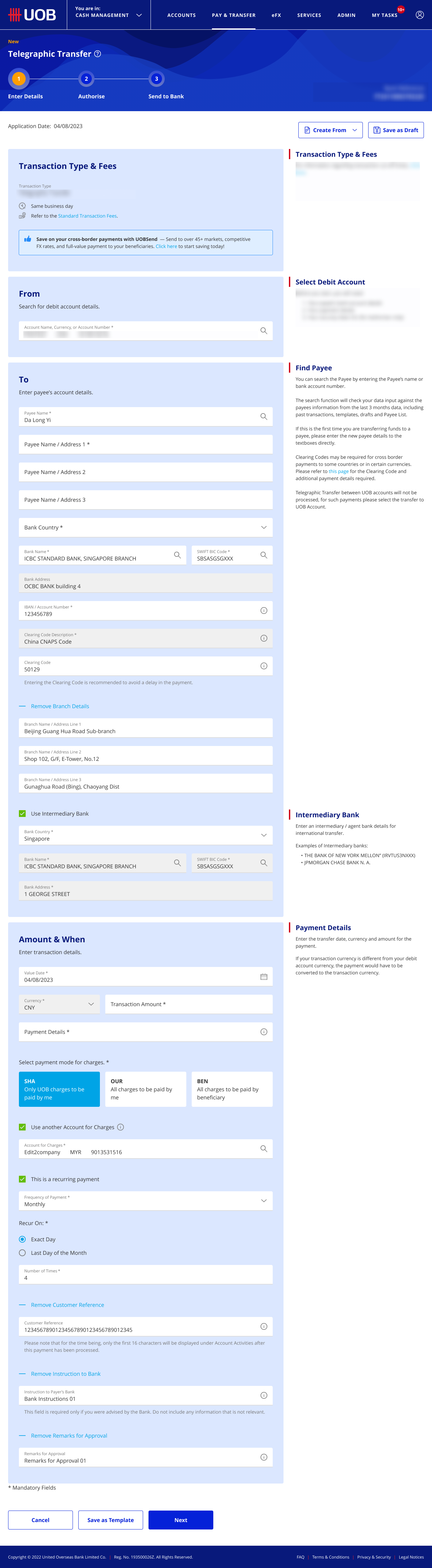
UOB Pay / UOB Send
The Problem
Corporate users moving significant sums across borders are under pressure. The existing flows created friction at the exact moments they needed the most confidence.
How I Approached It
I mapped the journey to find where trust broke down, not just usability. Where did users second-guess themselves? Where did language create ambiguity? That analysis drove prioritisation.
What I Did
Redesigned confirmation patterns, status communication, and decision architecture across the payment flow. Every change had to survive compliance and technical review.
Key Learning
In high-stakes flows, clarity beats cleverness every time.
02 / 04
Untangling a mental model nobody had mapped
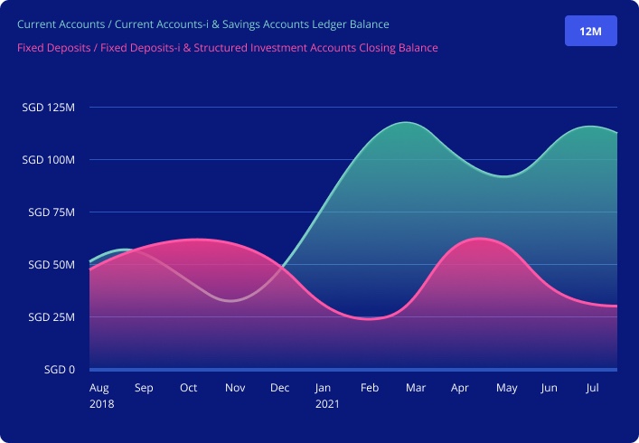
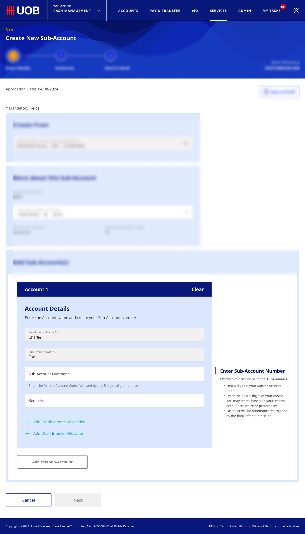
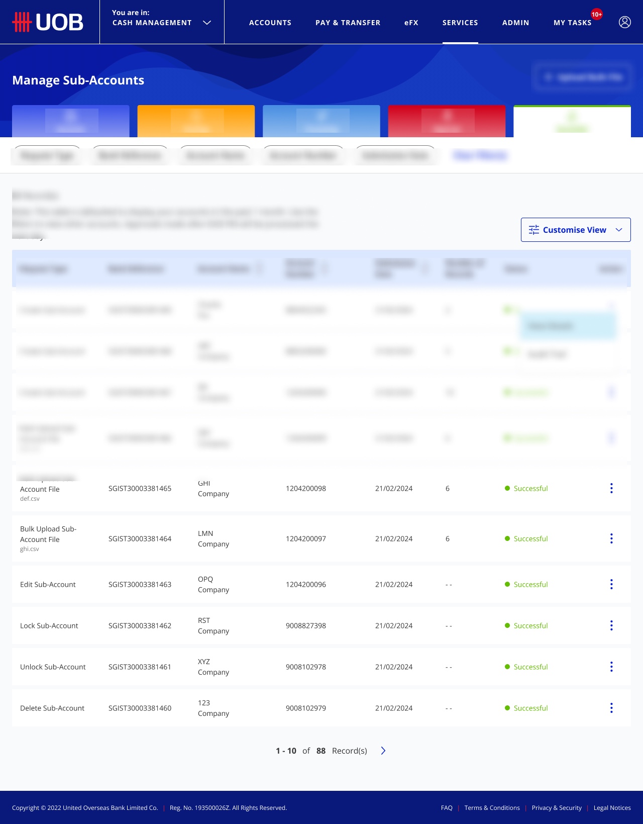
Virtual Account Sub-Account (VASA)
The Problem
Corporate clients managing complex account hierarchies, parent accounts, sub-accounts, multiple currencies, had no intuitive way to understand what they owned or how to navigate it.
How I Approached It
Before touching the UI, I focused on the mental model. How do these users think about account structures? The challenge was representational, making invisible hierarchy visible without overwhelming the screen.
What I Did
Designed the full sub-account experience, hierarchy visualisation, state management, flow architecture. Built closely with engineering around the actual data model.
Key Learning
The gap between how a system is built and how users understand it is where the real UX work lives.
03 / 04
The unglamorous work that actually makes a product better
Agile Product Enhancements
The Problem
Business teams regularly needed urgent UX changes within short sprint timelines. Volume was high, timelines were tight, and quality still had to hold.
How I Approached It
For every request, one quick check: does this serve the user, or just satisfy the ask? Often I'd land on something slightly different that did both. Sometimes I had to deliver what was asked. Knowing the difference mattered.
What I Did
Triaged and shipped 28+ UX improvements across live product flows, from minor refinements to full flow redesigns within sprint constraints.
Key Learning
Taste and speed don't have to be opposites. The skill is knowing what "good enough" means in context.
04 / 04
Designing for people who can't afford to miss things
Fraud Detection & Risk Monitoring (OFM FDR)
The Problem
Internal teams monitoring fraud and risk were scanning dense data under pressure, making time-sensitive calls. The tools gave them information, not clarity.
How I Approached It
I reframed it as a decision-support problem. Not "how do we show more data?" but "what does this person need to know in the next 90 seconds?" That shift changed the entire design direction.
What I Did
Designed the dashboard with a clear hierarchy based on urgency and decision-relevance. Worked directly with ops teams to understand how they actually worked, not just what they said they needed.
Key Learning
The best internal tools are invisible. When the interface stops being something people think about, you've done your job.
01 / 04
Improving Cross-Border Payment Workflows
UOB Pay / UOB Send
Problem
Corporate payment flows involved complex transaction requirements, making it challenging for users to complete actions quickly and confidently.
What I Did
Improved key payment interactions and refined transaction flows to make the experience clearer and better aligned with regulatory requirements.
02 / 04
Designing Sub-Account Management
Virtual Account Sub-Account (VASA)
Problem
Users needed a clearer way to create and manage sub-accounts within complex organisational account structures.
What I Did
Designed and refined the sub-account creation experience, simplifying account hierarchy visibility and improving usability.
03 / 04
Rapid UX Improvements & Business Requests
Agile Product Enhancements
Problem
Business teams frequently required urgent product updates and UX changes within short delivery timelines.
What I Did
Collaborated with product and engineering to quickly assess requirements, propose UX solutions, and support implementation.
04 / 04
Internal Operational Dashboard
Fraud Detection & Risk Monitoring (OFM FDR)
Problem
Operational teams needed a clearer way to monitor fraud activity, risk scoring, and security controls across the platform.
What I Did
Designed an internal dashboard focused on improving visibility of operational data and supporting faster decision-making.
Outcome
What it added up to
Two years. Real constraints, real consequences. Work that's used daily across Southeast Asia.
I learned to hold the line on quality under pressure. Great UX at enterprise scale isn't one brilliant solution, it's hundreds of small, considered decisions made consistently over time.
Reflection
The best design work is invisible. No one notices the confirmation pattern you agonised over, they just feel more confident. That's the job.
The real skill isn't designing within constraints, it's making something feel effortless despite everything underneath. That tension is what I find most interesting about this work.
If I were starting over
I'd document design decisions as we went, not just Figma files but the rationale. Knowledge lives in people's heads. A decision log would have made every handoff smoother.