AirAsia
Optimising the check-in flow for passengers
Enhancing the flight booking experience by simplifying key journeys and reducing decision friction.
Redesigning the mobile check-in experience for AirAsia's super app
Overview
About this project
AirAsia is a Malaysian low-cost airline serving over 165 destinations across 25 countries. As the company expanded its platform into a super app, the team identified low adoption of the mobile check-in feature.
The challenge was to redesign the check-in experience so passengers could complete the process quickly and contactlessly through the app — without needing to visit airport counters.
Challenge
Defining the problem
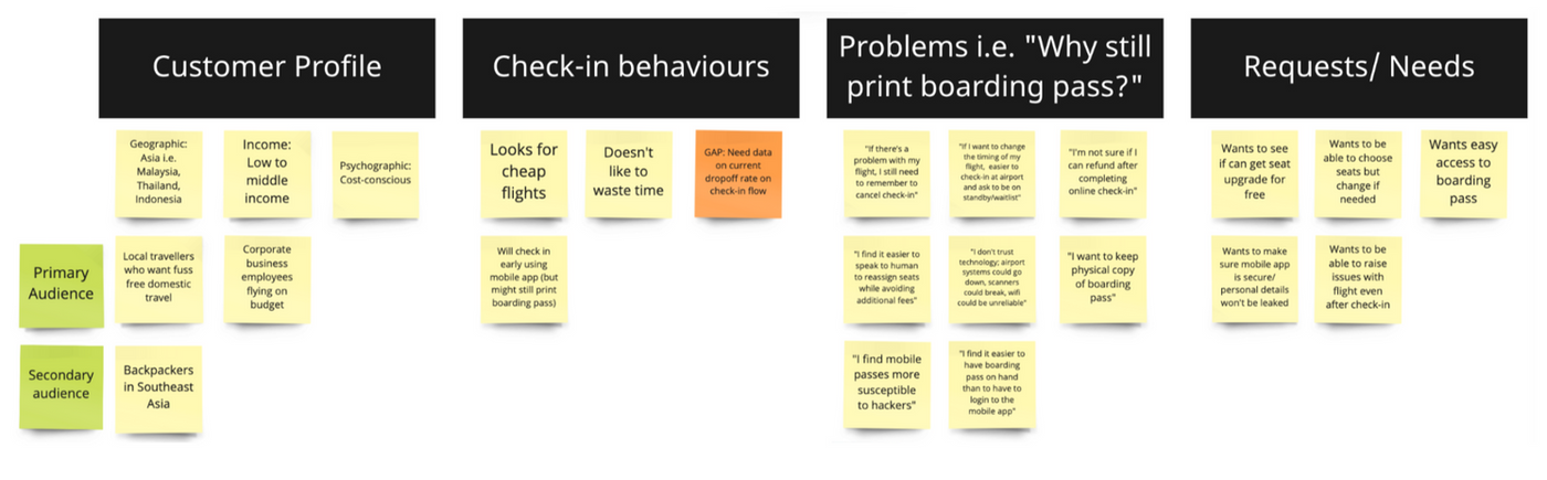
Despite AirAsia's investment in mobile capabilities, passengers were not adopting the mobile check-in feature. We needed to understand why, and redesign the experience to be simple and trustworthy enough to replace airport counter check-in.
Problem Statement
"How might we simplify the mobile check-in journey so passengers can complete the process quickly and confidently without relying on airport counters?"
Objectives
- Increase adoption of the mobile check-in feature by creating a seamless, contactless experience.
- Ensure passengers can retrieve and present their boarding passes digitally without additional airport steps.
- Redesign the e-boarding pass interface to improve readability and reduce information clutter.
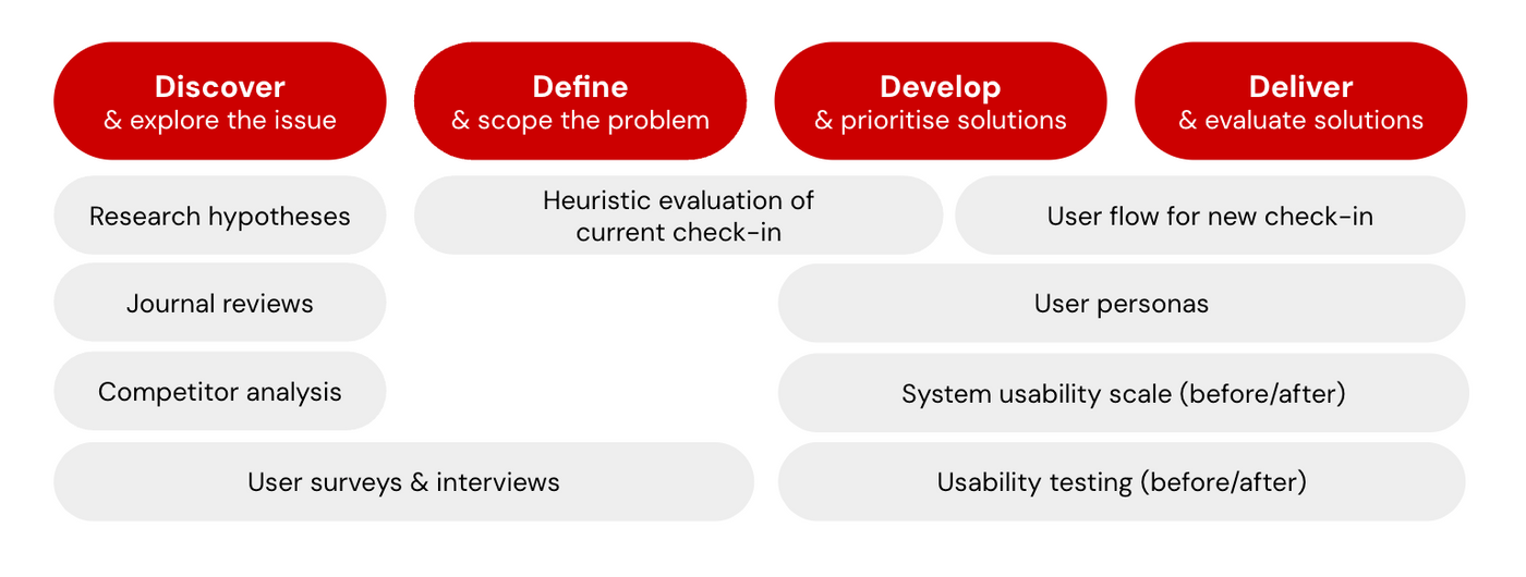
Research
Understanding passenger behaviour
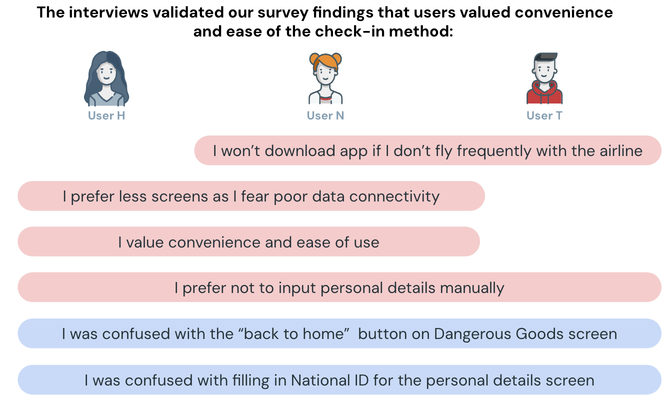
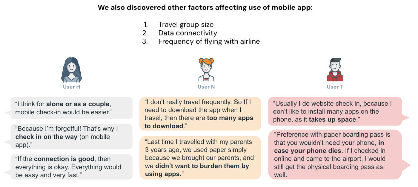
We used a combination of desk research, heuristic evaluation, competitive analysis, and user surveys to understand why passengers preferred airport counter check-in over the mobile option.
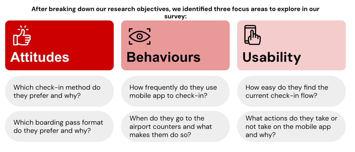
Research Objectives
- Understand passenger needs, motivations, and pain points related to mobile check-in.
- Map current check-in behaviours and identify expectations for a mobile-first experience.
- Investigate why passengers prefer airport counter check-in over the mobile option.
Research Methods
Desk Research
Academic Literature Review
Reviewed journal articles on mobile flight booking and self-check-in kiosk adoption in Malaysia. Samples of 300 (2017) and 402 (2019) respondents provided a baseline understanding of passenger attitudes toward digital travel tools.
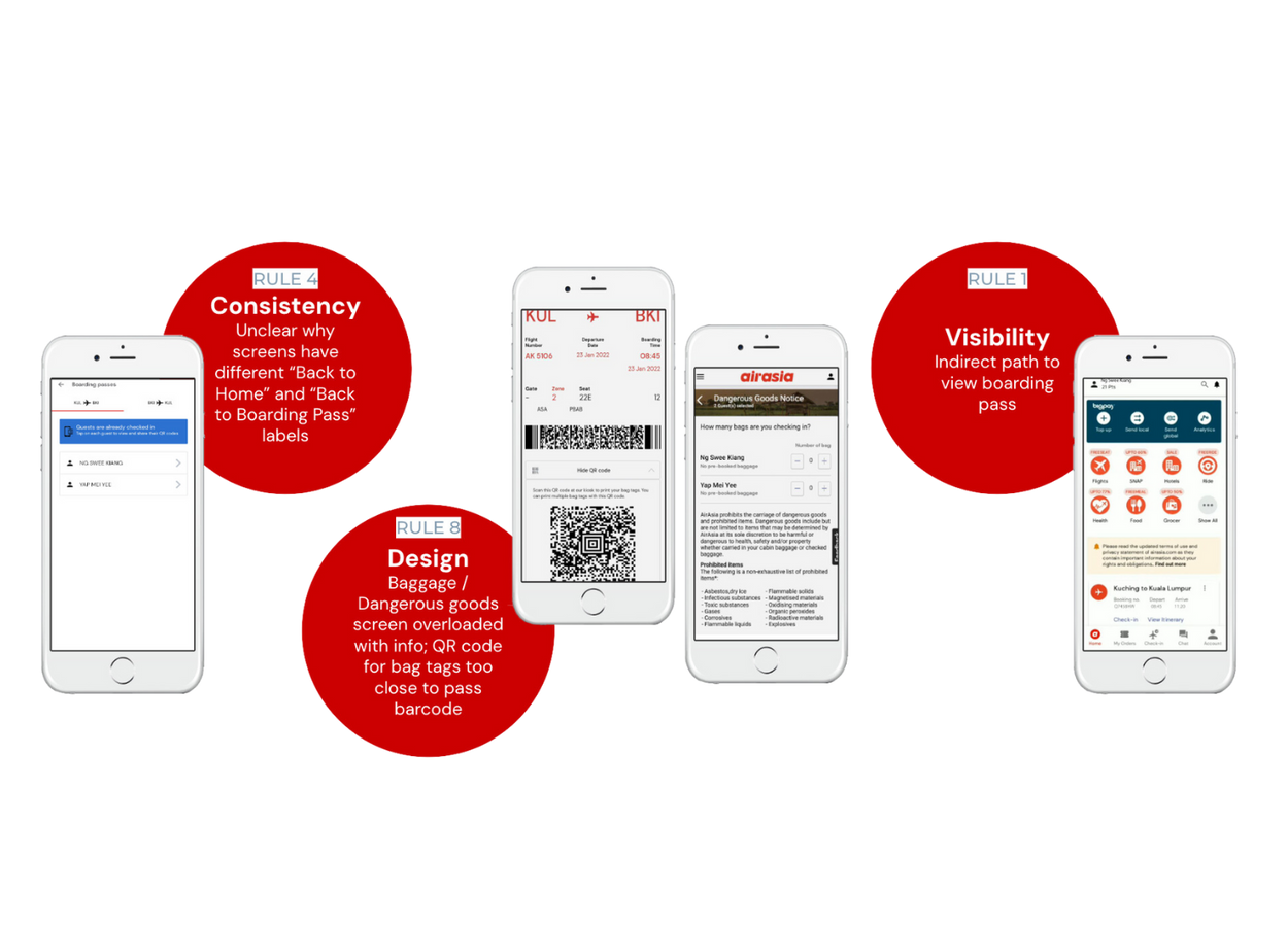
Heuristic Evaluation
Independent Walkthrough
Conducted an independent walkthrough of the current check-in flow to test usability and surface interface issues. Evaluated findings using Nielsen's Heuristic Evaluation framework.
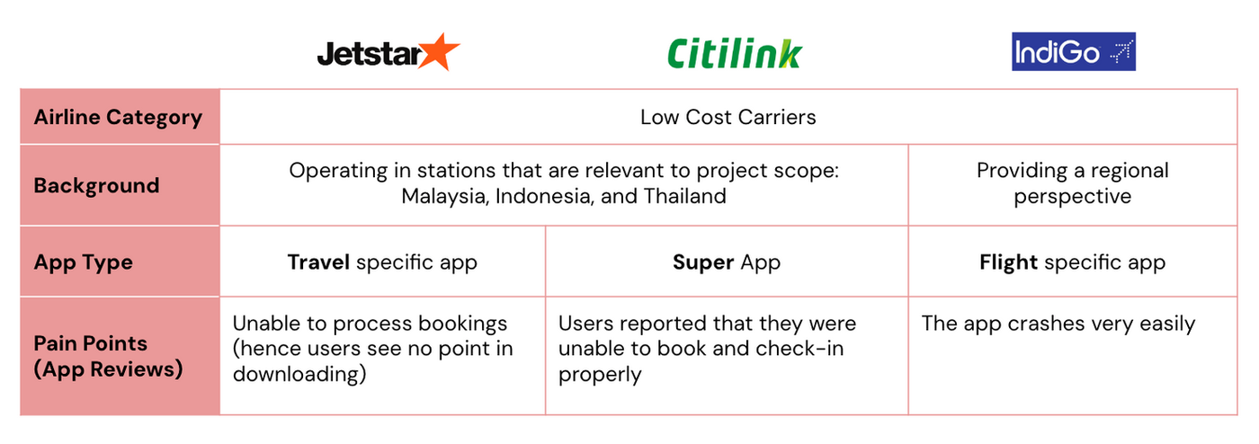
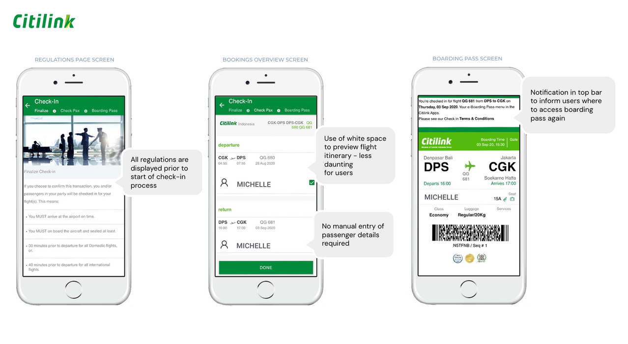
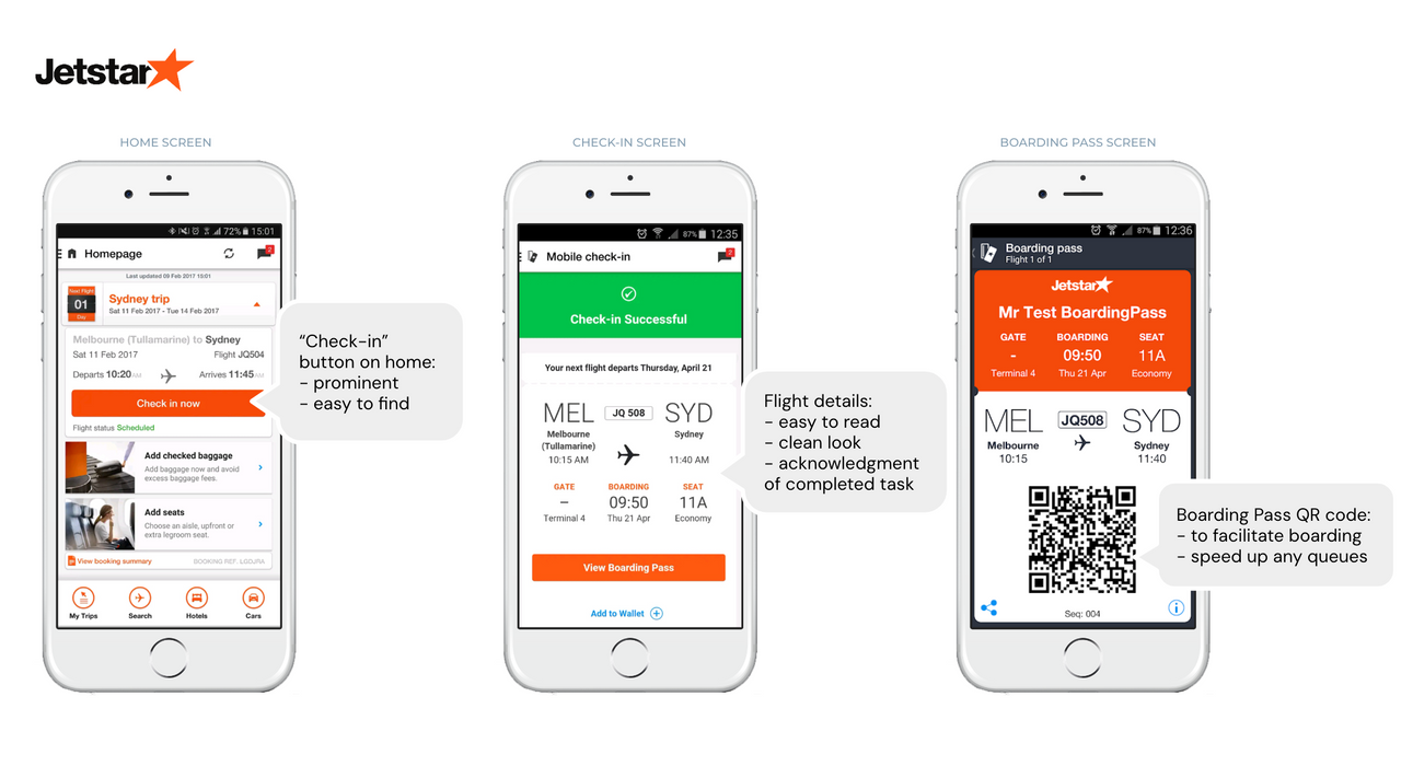
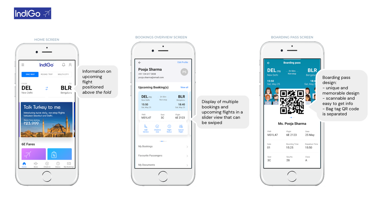
Competitive Analysis
Benchmarking Against Competitors
Focused on three dimensions: how competitors structure their check-in process, how relevant information is presented, and what users think about competing apps.
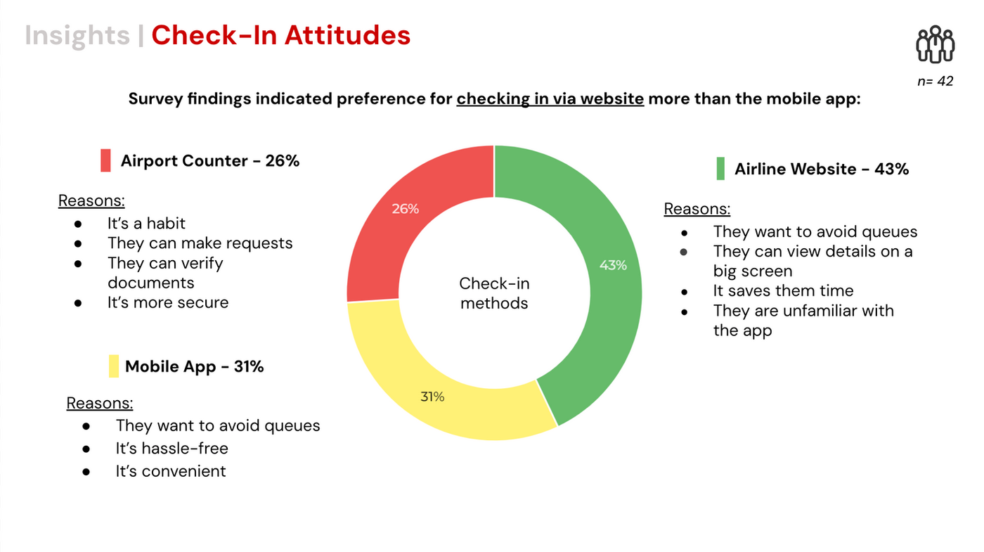
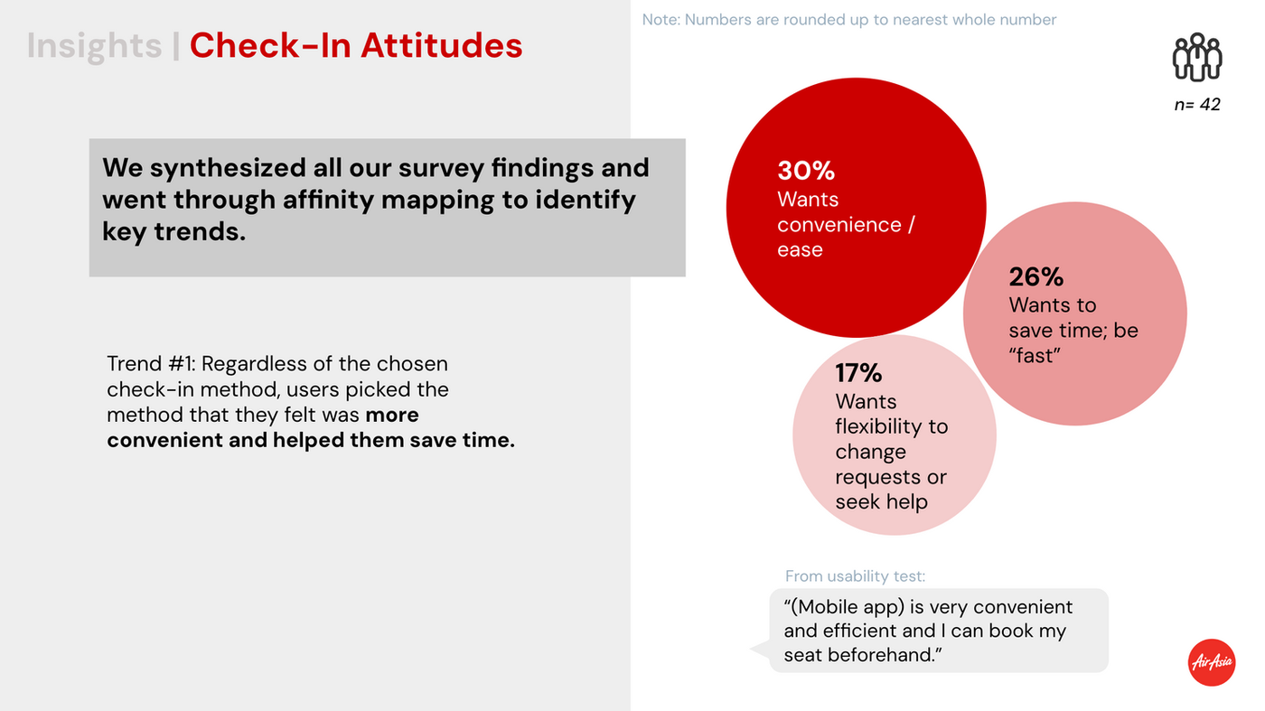
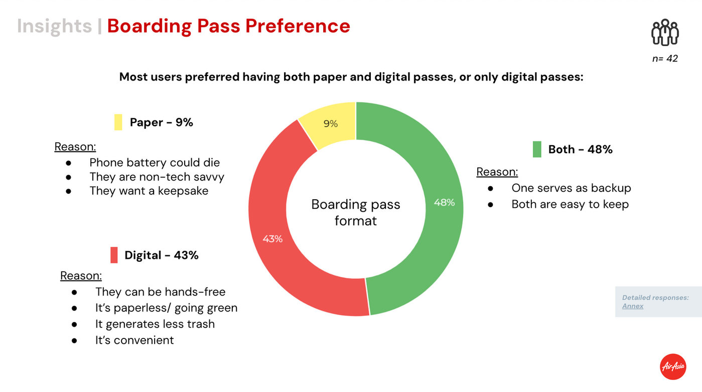
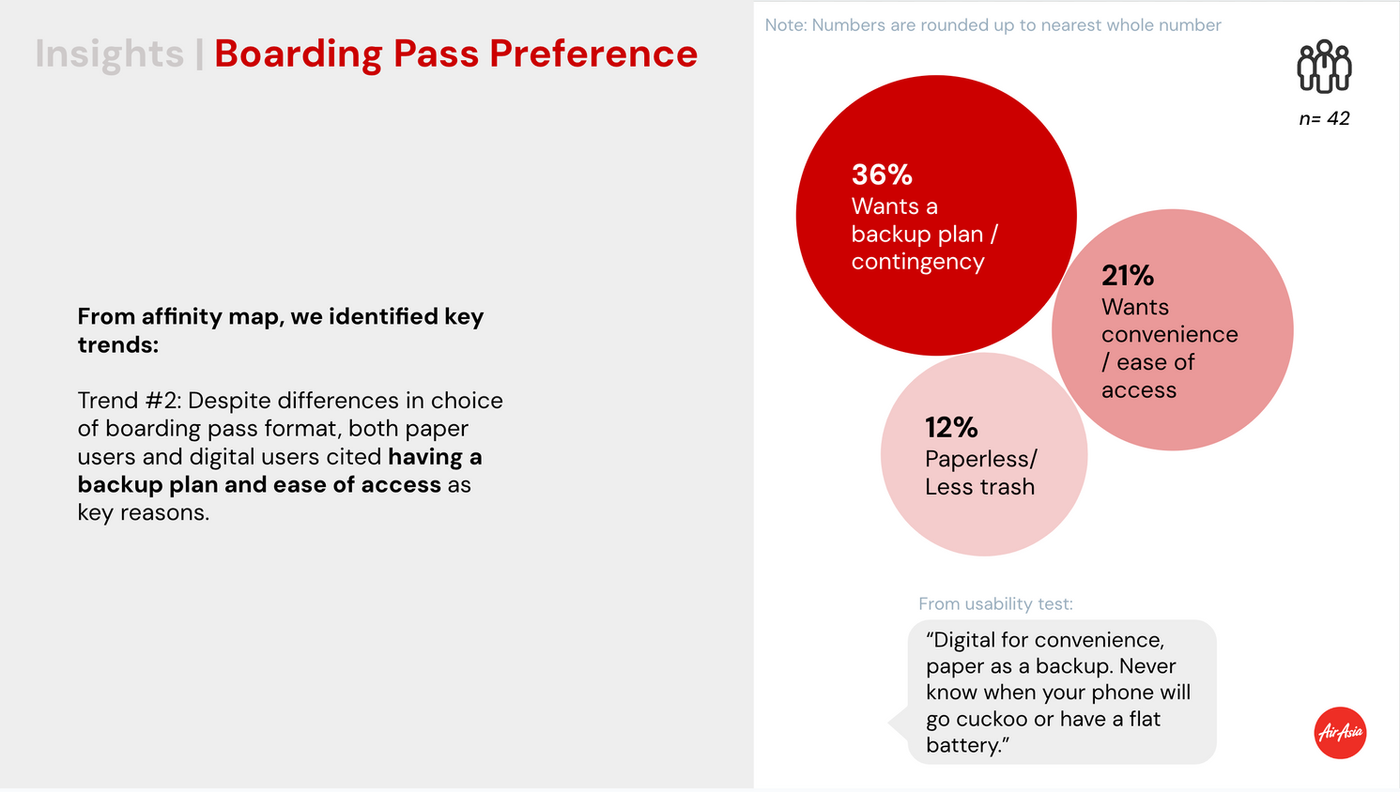
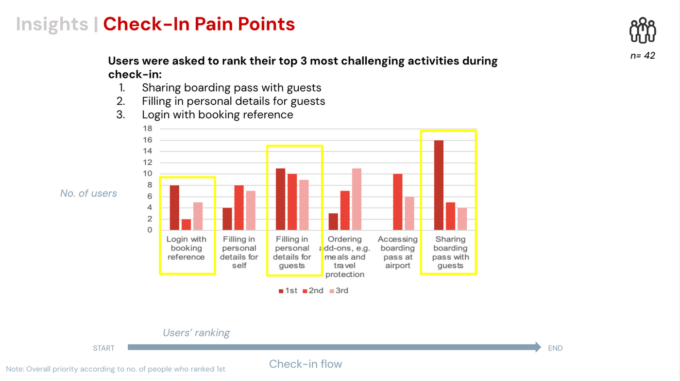
User Survey
42 Respondents
Conducted a survey to explore passenger attitudes, behaviours, and self-reported usability challenges with mobile check-in.
Desk Research
We went to research if our hypothesis was true by looking through reviews, articles, comments and journal articles. We then gathered our findings.
Journal article 1:
- Flight ticket booking app on mobile devices: Examining the determinants of individual intention to use
Malaysia, 2017, Sample size of 300
Journal article 2:
- Airport passengers' adoption behaviour towards self-check-in Kiosk Services: the roles of perceived ease of use, perceived usefulness and need for human interaction
Malaysia, 2019, Sample size of 402
We went to research if our hypothesis was true by looking through reviews, articles, comments and journal articles. We then gathered our findings.
Heuristic Evaluation
We conducted an independent walkthrough of the current flow to rest usability and interface issues, we evaluated them with Heuristic Evaluation.
Competitor Analysis
We wanted to focus on 3 aspects in our Analysis:
- ✅ How is their process of check-in is like?
- ✅ How are relevant information presented?
- ✅ What do users think about their app?
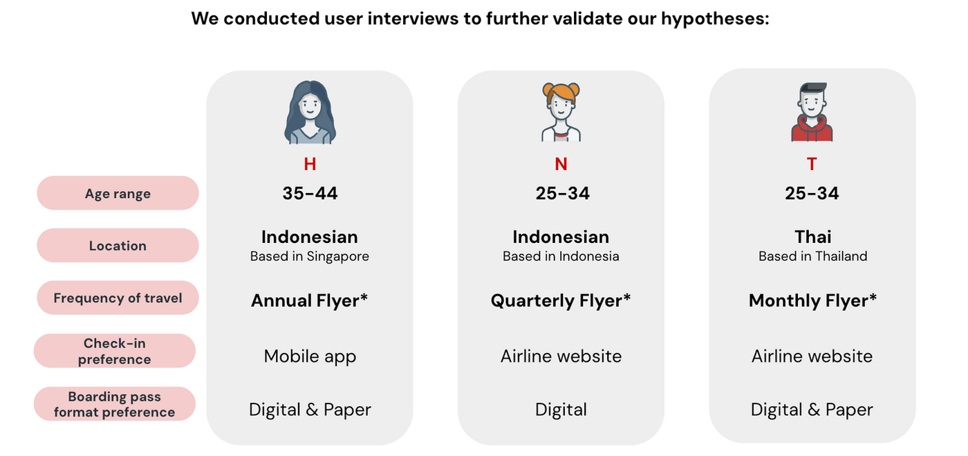
User Interview
We conducted user surveys and interviews to understand passenger attitudes, behaviours, and self-reported usability challenges with mobile check-in (n=42).

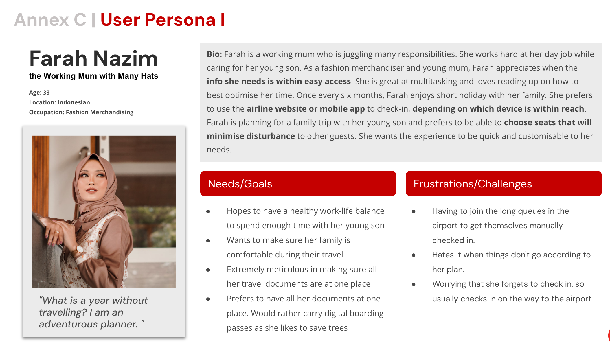
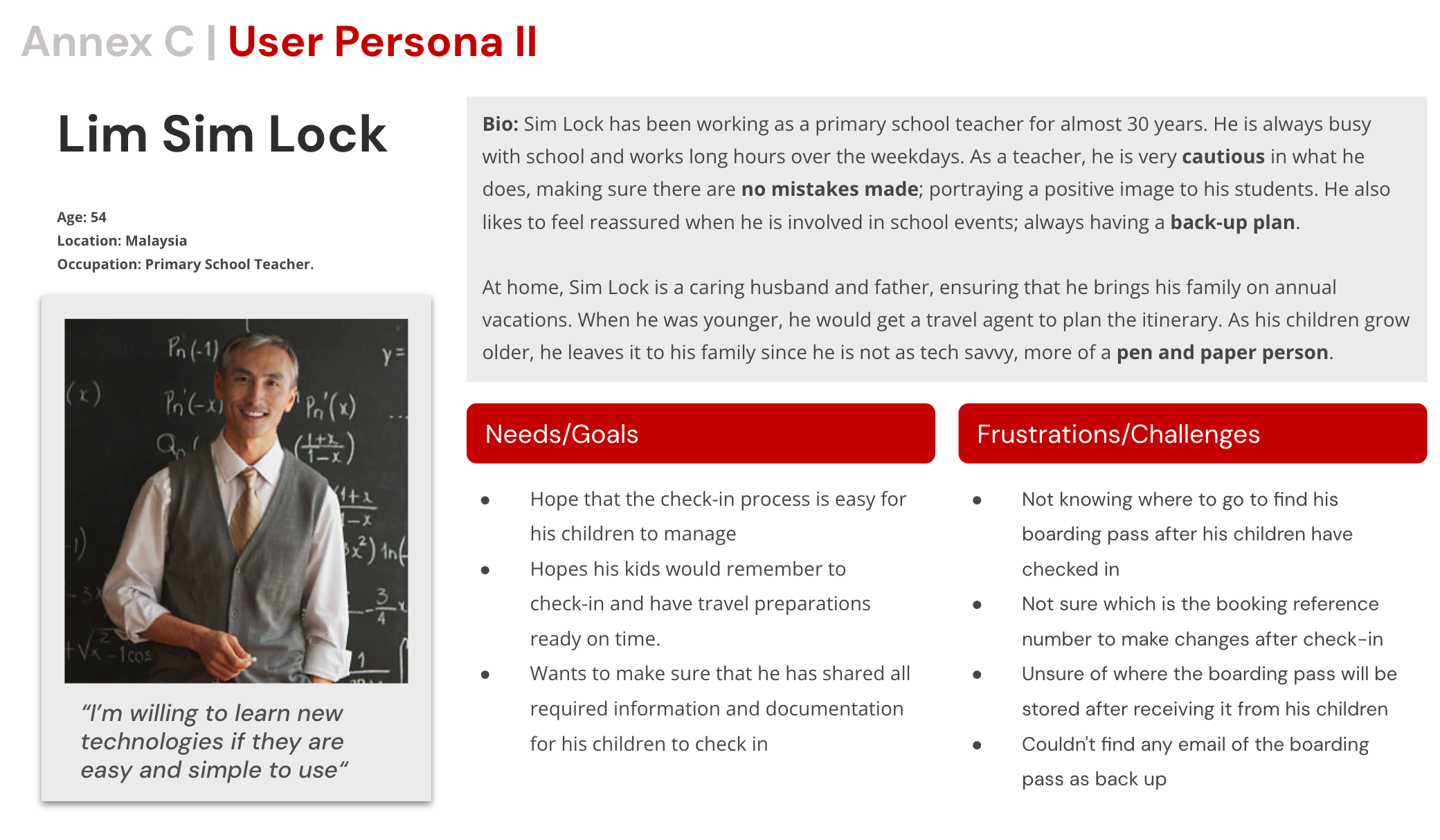
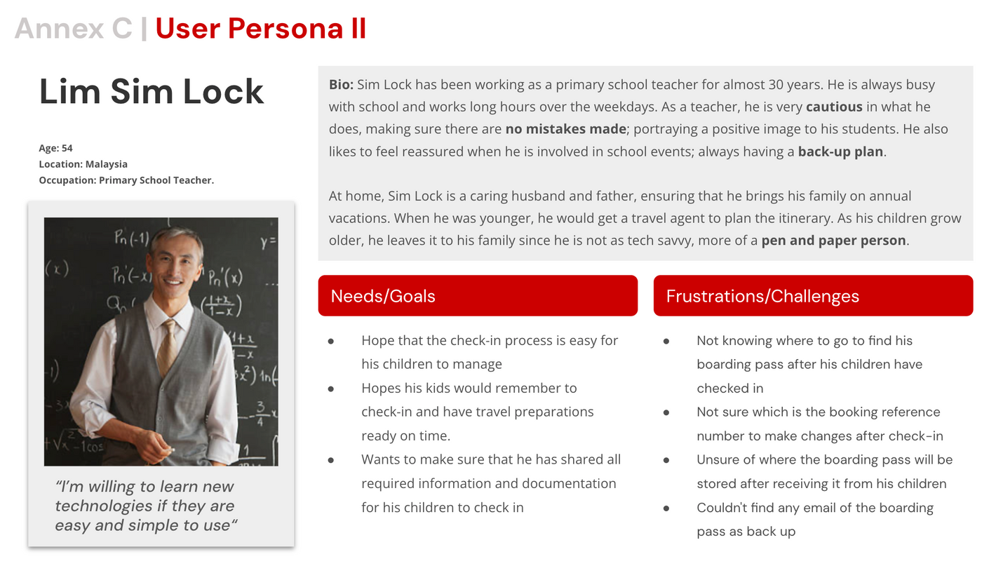
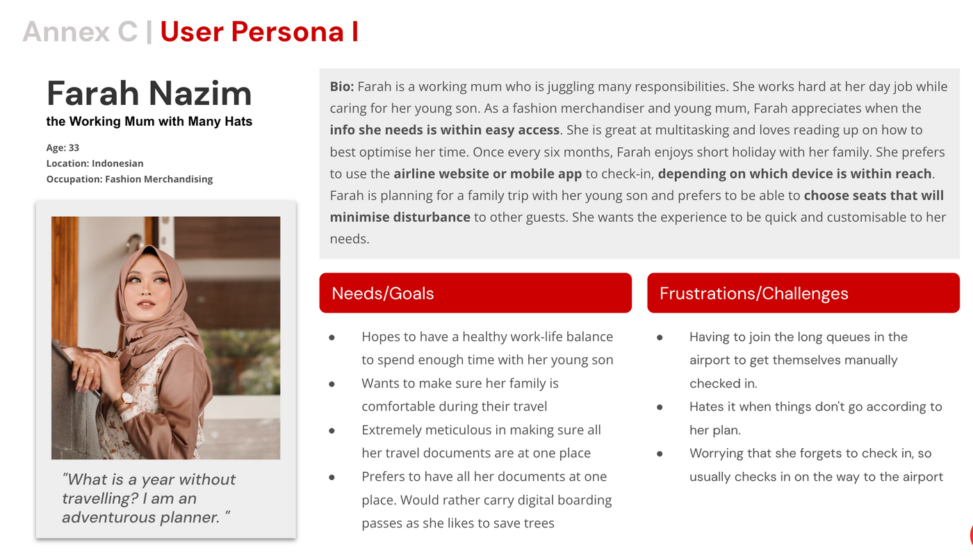
User Persona
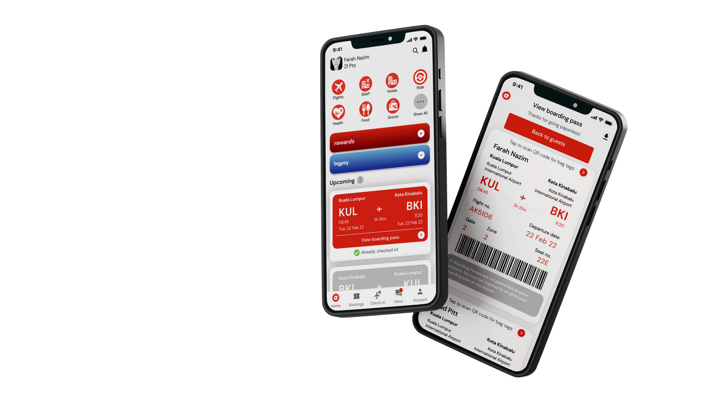
Final Prototype
The redesigned check-in experience
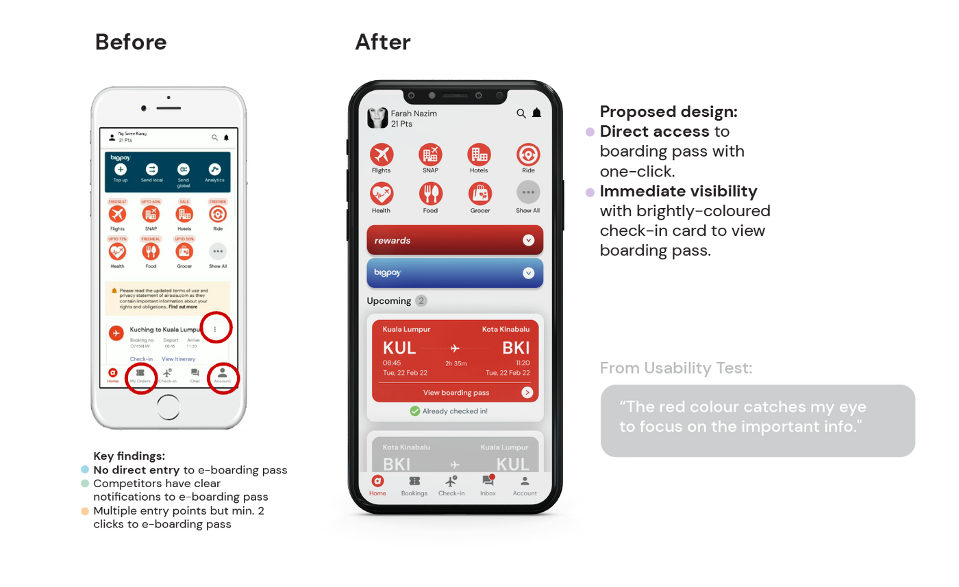
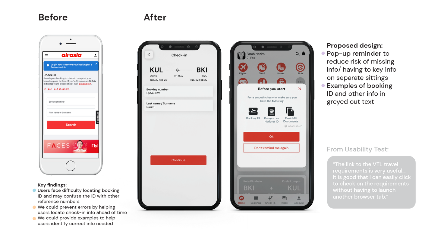
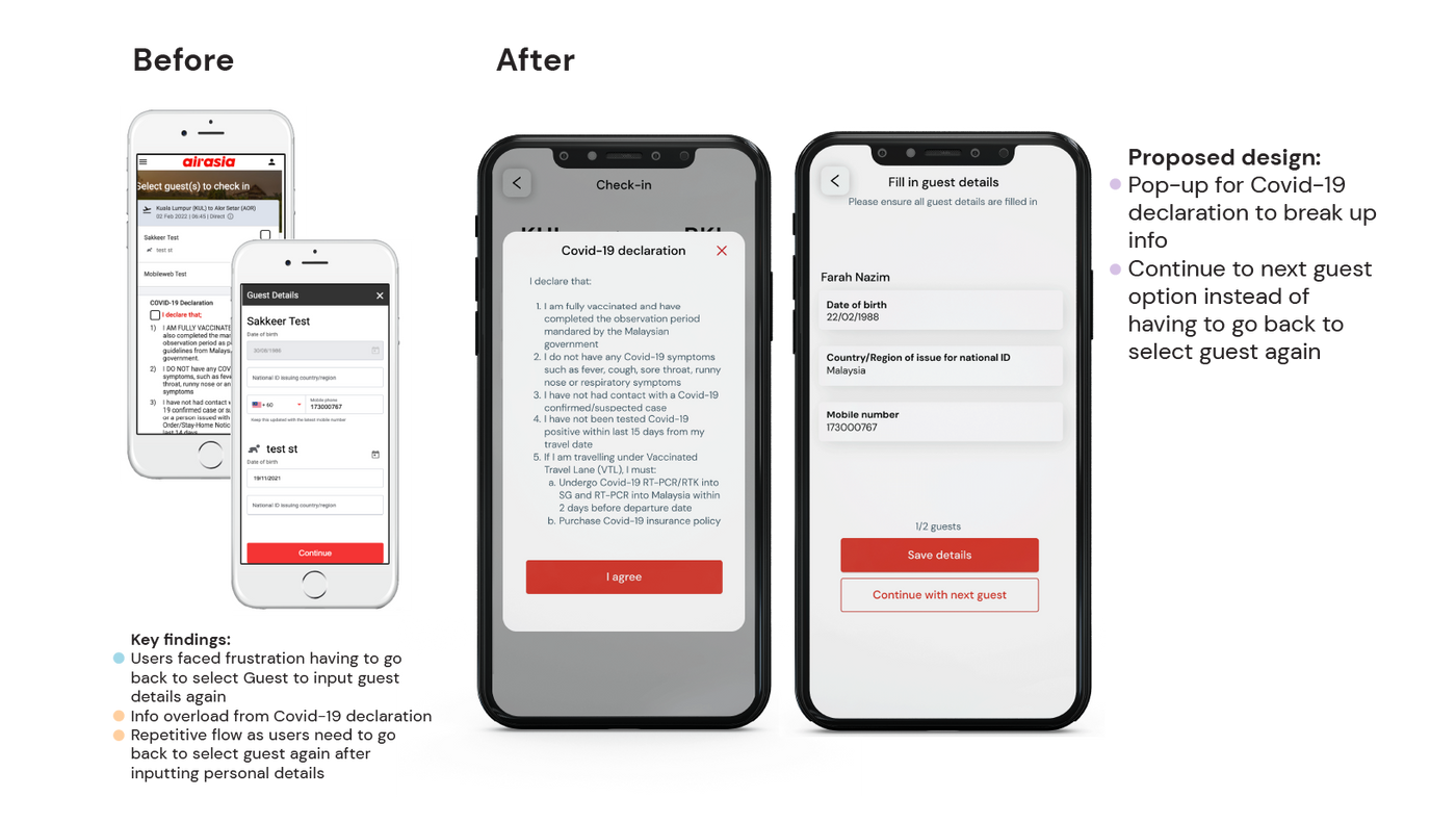
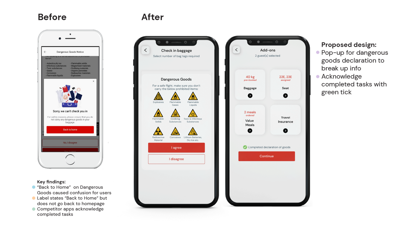
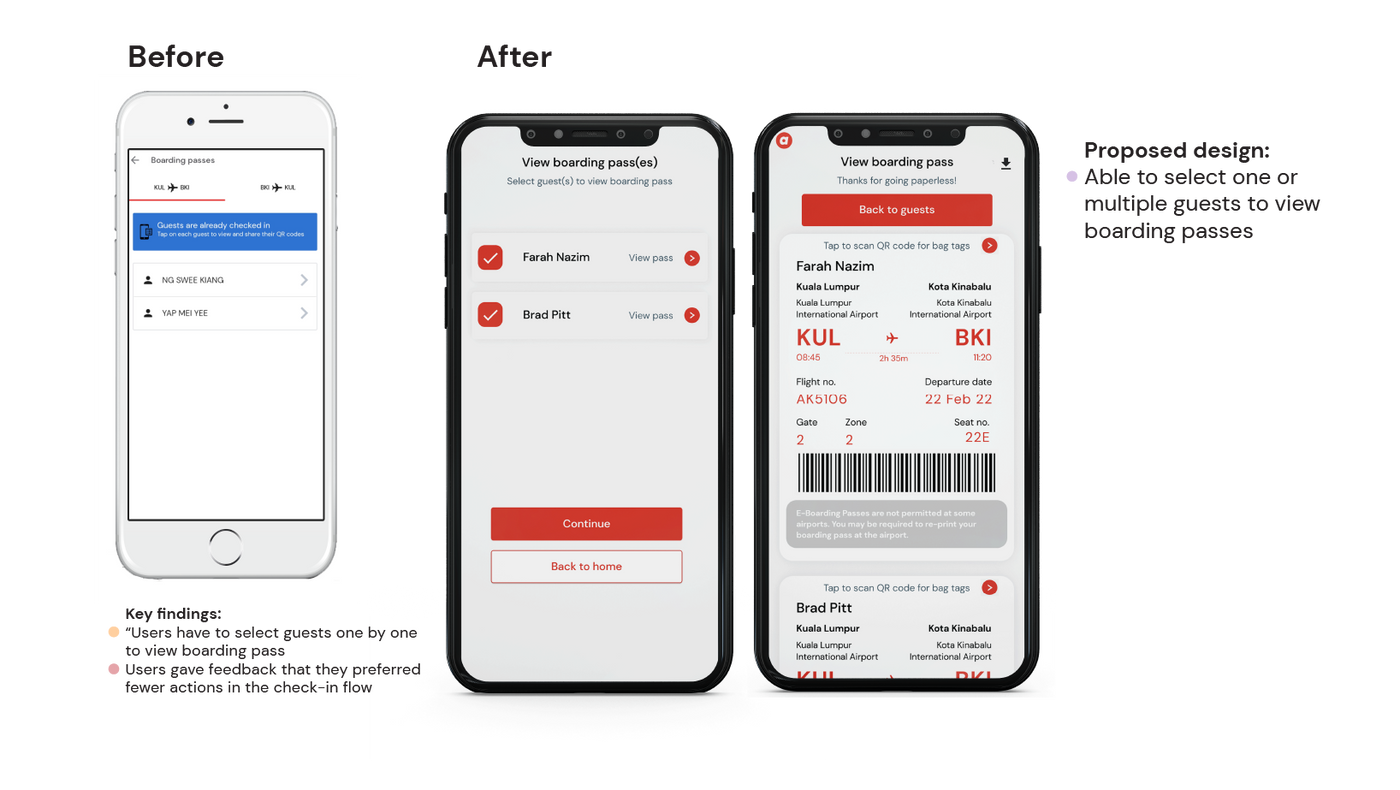
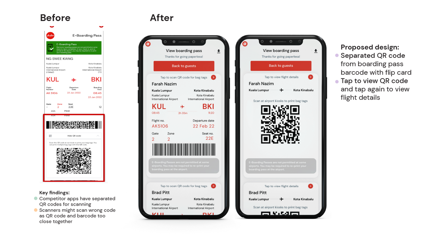
The wireframes were developed from our research findings, turning insights into structured, solution-driven design decisions. The final prototype simplifies the check-in journey so passengers can complete it quickly and confidently.
Prototype in Motion

Full Artboard Screens
Reflection
What I'd improve
Looking back on the project, there are four areas I'd focus on given more time or resources.
Deeper Research into Mobile Check-in Behaviour
Future work could focus more specifically on how passengers interact with mobile check-in, as most existing research focuses on the booking journey rather than post-purchase flows like check-in and boarding.
Broader Participant Recruitment
With more resources, expanding participant recruitment beyond our immediate network would provide more diverse user insights and reduce sampling bias in our findings.
Stronger Connection Between Research and Design
Developing clearer user journeys and ensuring personas directly inform design decisions at each step would strengthen the overall experience and make the rationale more traceable.
Simplifying Interaction Patterns
Reducing reliance on pop-ups and exploring more streamlined interactions could improve the flow of the prototype and reduce cognitive load at key decision points.