The Nutrition Clinic
Creating a product to improve Singaporeans' sleep
Improving how people understand and improve their sleep through a research-led digital experience.

Deep Sleep — a lifestyle-oriented sleep improvement product by The Nutrition Clinic
Overview
About this project
The Nutrition Clinic in Singapore launched Deep Sleep to help Singaporeans improve their sleep habits. Targeted at adults aged 20–40, the programme offers affordable sleep bundles with personalised add-ons such as supplements and diagnostic tests, alongside a community platform aimed at raising awareness around sleep health.
My team was brought in to evaluate and design an effective landing page experience that resonates with the target audience while validating key business assumptions for product–market fit.
Challenge
Defining the problem
The Nutrition Clinic needed to understand whether their new sleep product would resonate with their target audience, and how to communicate its value clearly on a landing page.
Problem Statement
"How might we better understand the motivations and behaviours of our target audience so we can communicate the value of Deep Sleep in a way that truly resonates with them?"
Research Objectives
- Understand the key factors customers consider when purchasing or gifting a mindfulness or well-being programme.
- Identify the most effective landing page structure and content for the target audience.
- Explore how users currently cope with and manage sleep-related challenges.
Research
Understanding the sleep landscape
We used user surveys and competitive analysis to understand the market and identify opportunities for Deep Sleep to differentiate.
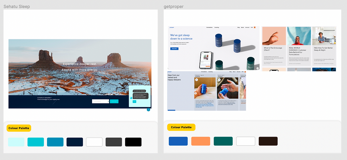
Key Finding — A Lifestyle Gap in the Sleep Market
Among 83 respondents with average to poor sleep quality, research revealed a significant gap between clinical treatment providers and self-managed solutions.
Gap
Opportunity: Position Deep Sleep as a lifestyle-oriented solution that bridges the gap between clinical sleep services and DIY sleep aids — filling a space that the market had largely left unaddressed.
Additional Research Themes
- Low Awareness — Sleep is not widely seen as part of holistic wellbeing among the target demographic.
- Trust and Value Drive Purchases — Users need credibility signals (accreditation, reviews, expert backing) before committing to a wellness product.
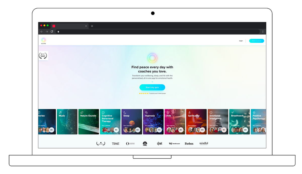
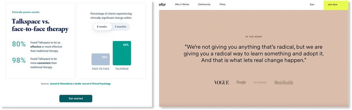
- Competitors rely on clinical positioning — Most existing offerings skewed medical or clinical, leaving the lifestyle space open.
Research Image Findings

Personas
Two personas were created representing the target demographic for Deep Sleep — Cheryl (the "Young Optimist") and Timothy (the "Caring Husband") — capturing the range of motivations and decision-making styles we needed to design for.


Design Decisions
Turning insights into design choices
Content Audit & Direction
Using insights from research, we reviewed and refined content for the landing page — identifying what to clarify, strengthen, or newly create to address the target audience's needs and decision drivers.
Differentiating Through Visual Identity
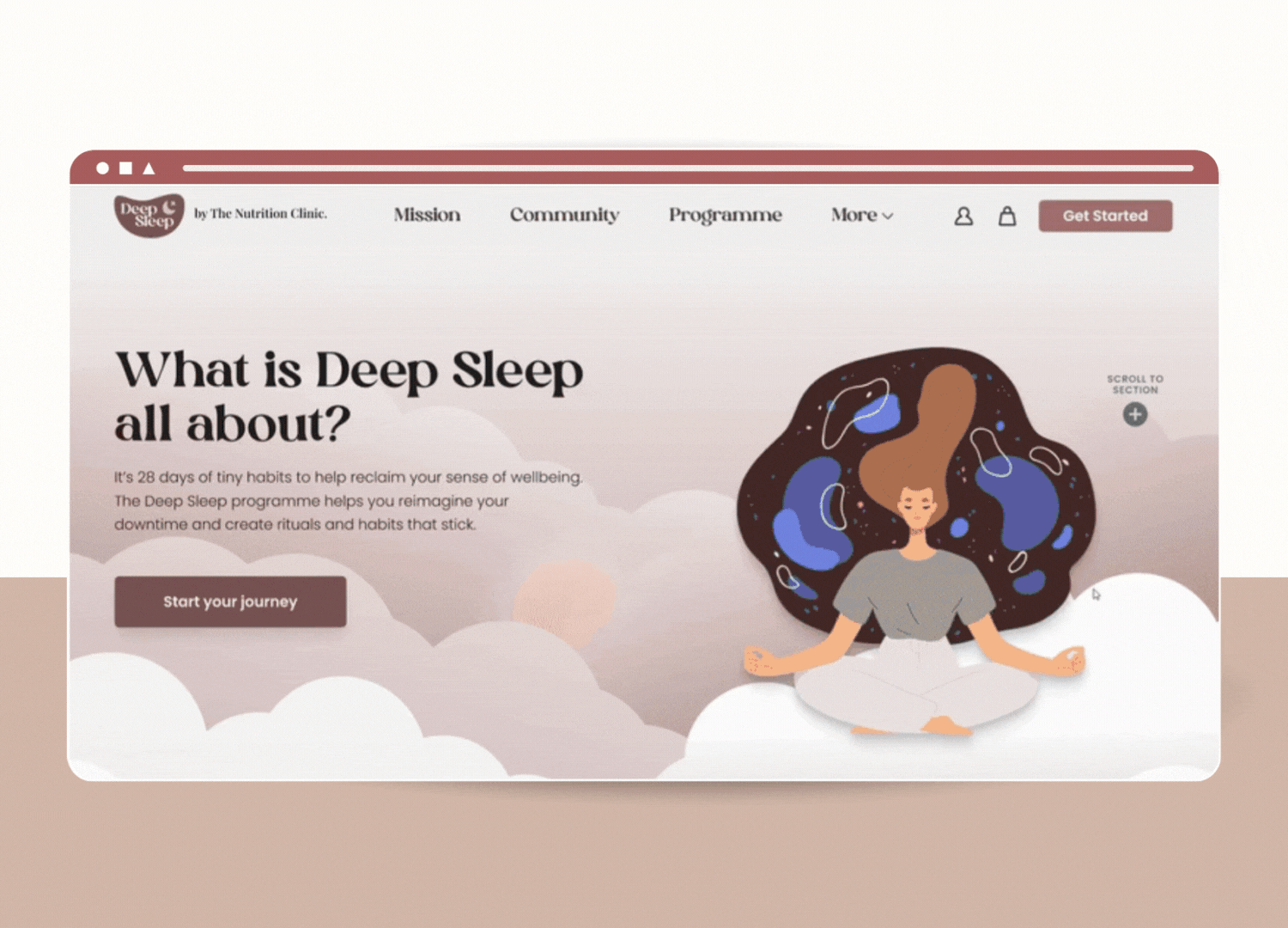
Most competitors relied on blue (clinical positioning). We introduced a maroon palette inspired by dusk and sunset tones, creating a warmer, more calming identity for Deep Sleep.
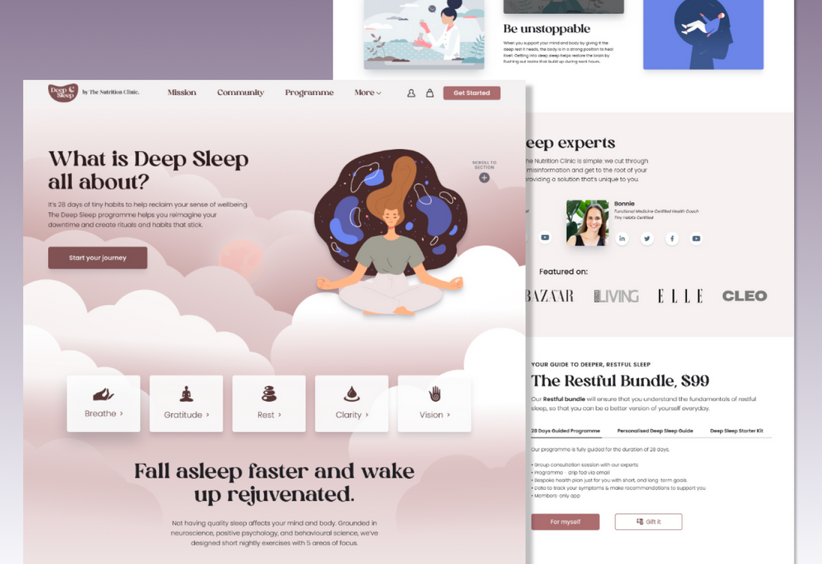
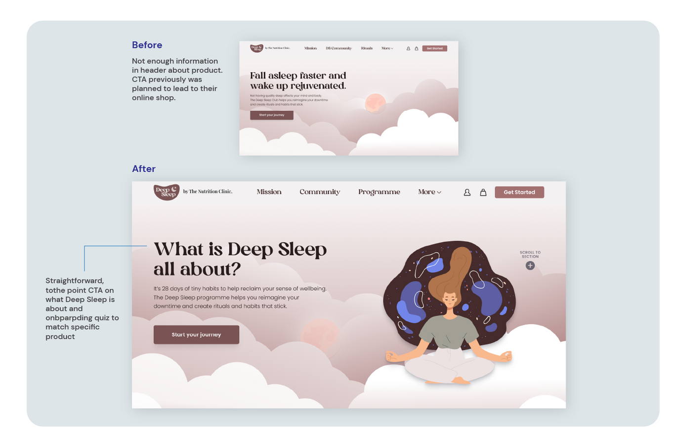
Clear Value Proposition Above the Fold
Competitor sites used concise headers to quickly communicate purpose. We prioritised a strong headline and CTA early in the user journey, with the option of an onboarding quiz.
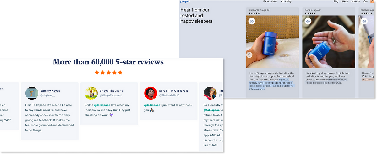
Social Proof Through Reviews
Many competitors used short testimonials or review snippets. We integrated review sections to strengthen credibility and reduce purchase hesitation.
Building Credibility Through Accreditation
Several competitor sites highlighted scientific backing, certifications, or media features. We added trust signals to reinforce authority and help users feel confident in the product.
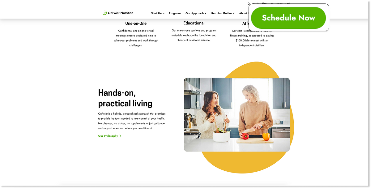
Persistent Call-to-Action
We implemented a fixed CTA button that remained visible while users scrolled, ensuring the primary action was always accessible regardless of where users were on the page.
Testing & Iteration
Usability testing & refinement
Creating for the target audience
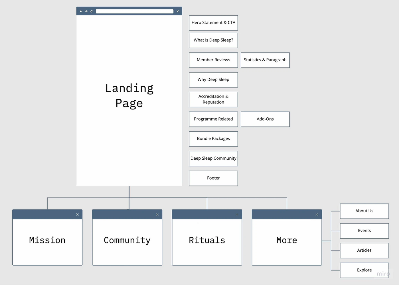
We structured the landing page's information architecture to clearly communicate the value proposition and strengthen user trust.
We conducted a usability testing to test our prototype's content and copy, these are the following improvements we made based on user Feedback:
"The information that appears on the top feels too bare to understand fully about what the site is talking about."
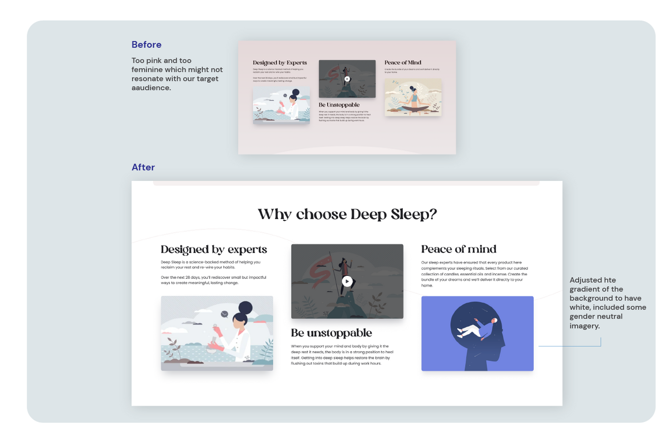
"The landing page gave off a vibe that it's a female-centric product."
We decided to use less of the maroon colour and changed some sections to white, and also changed some images so that it had a mix of both feminine and masculine.
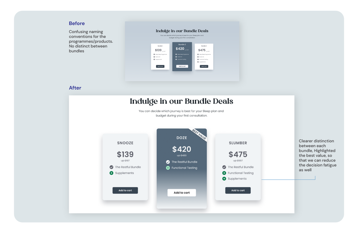
"The naming convention on the programme / product is confusing. I'm not sure what difference between the starter kit and the bundle sets."
Previously, there was no clear distinction on what the starter kit was versus the other bundle deals that Deep Sleep offered.
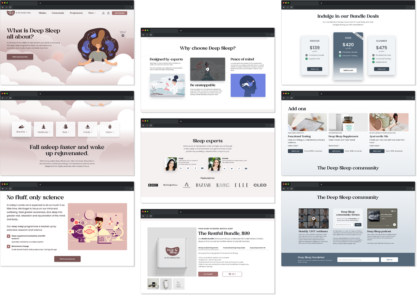
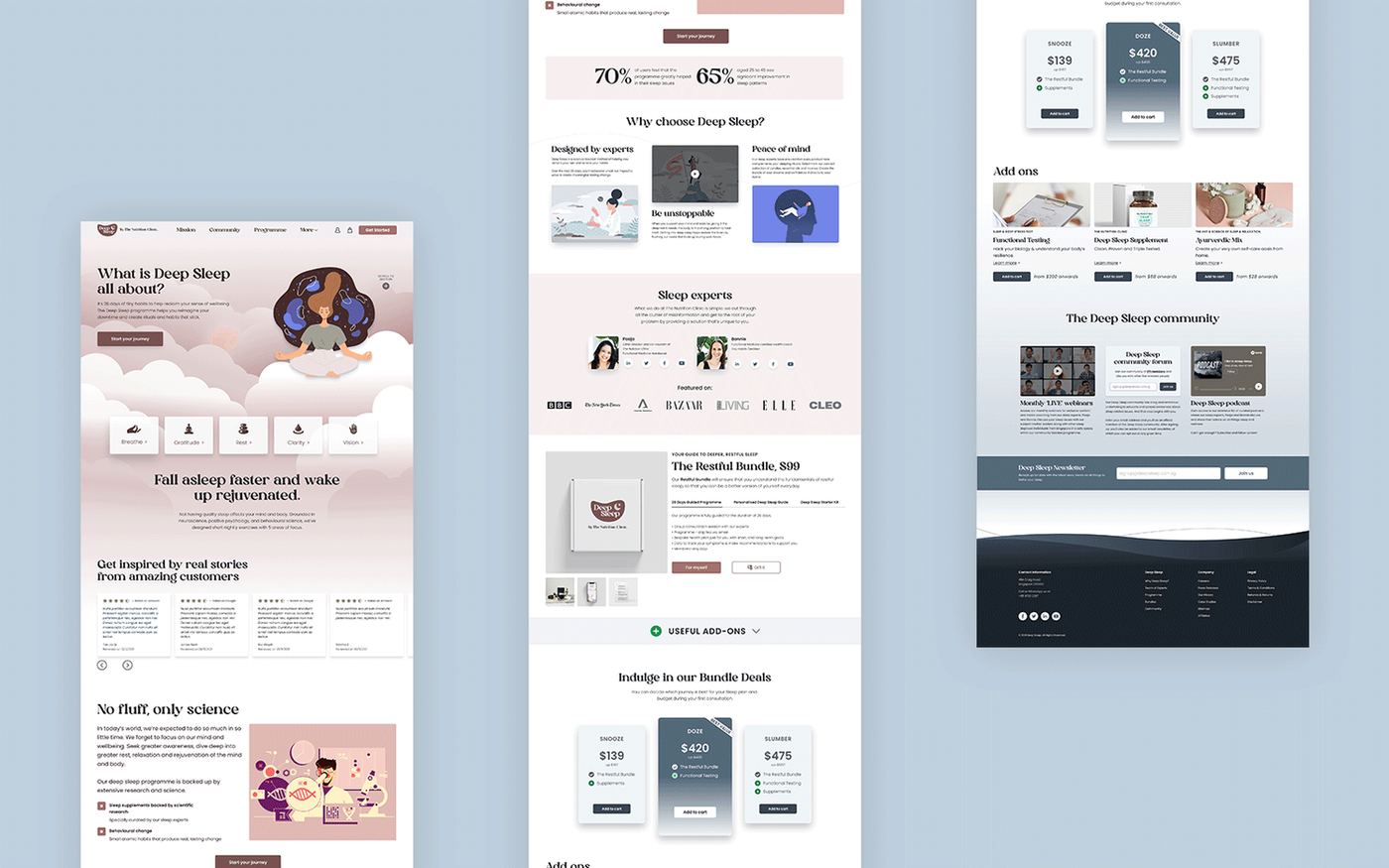
Final Prototype
The final design
The wireframes were developed from our research findings, turning insights into structured, solution-driven design decisions. The final prototype reflects the refined IA, visual identity, and trust-building elements identified through research and testing.
Results
Outcomes
Client Feedback
"You've given us a great starting point with areas that we need to consider a bit closer..."
"Great job team, appreciate the hard work being poured into the project. Hoping to work with some of you once the dust settles a little bit."
What I'd Improve
Test the Onboarding Concept
Due to the 4-week project timeline, I was unable to validate whether the onboarding quiz effectively helped users navigate the site. I would use user journey data and behavioural analytics to evaluate this.
A/B Testing on the Live Website
I would run A/B tests on the live website to compare landing page variations and identify which approach drives stronger engagement and conversion over time.